Avoca — Design System
Design systems, Product design, Development, Health
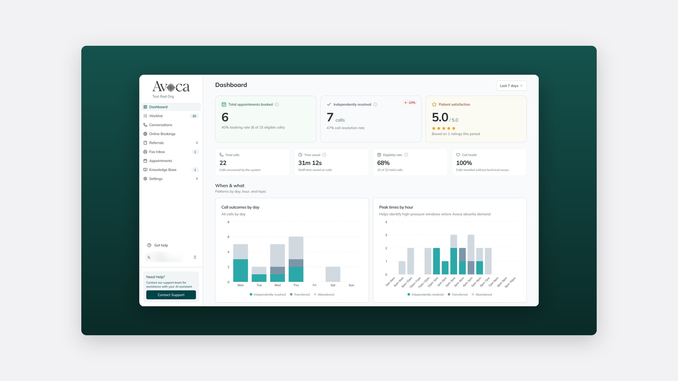
Avoca is a Y Combinator-backed operations platform for radiology, used across 250+ clinics including Lumus, Synergy and Queensland Radiology. I joined in October 2026 as Principal Product Designer to give a fast-shipped product one design system.
- Role
- Principal Product Designer
- Team
- Product and engineering, through Owlry
- Timeline
- 2026–present
- Platform
- Web
250+
clinics on the platform
14px
base, type scale ~1.2
1
table pattern, two filter modes
The problem
A product built one screen at a time
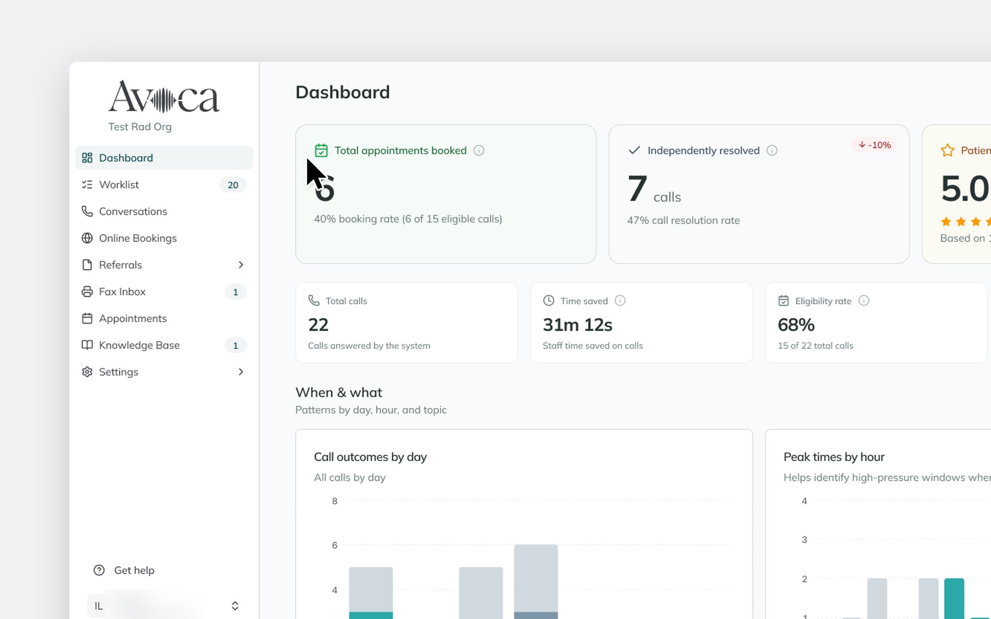
Each table, filter, drawer, pill, form and empty state had been built for the screen in front of it. Together they felt assembled, not designed.
Calm next to clinical software
Front-desk teams use Avoca beside clinical systems like Comrad, Karisma, Visage and Epic, handling calls, bookings, referrals and faxes all day. It has to feel calm and trustworthy, not shout for attention.
My role
Giving existing work a direction
I lead the design system and product design, part time through Owlry. Engineering was already moving screens onto shared components, so I gave that work a direction and a standard.
The process
Audit first, then a scorecard
I audited the components, brand guidelines and lint rules, starting with the Services UI, which touches the most clinic workflows.
Three words to check every screen
The brand qualities became a scorecard, turning "I don't like it" into a question the team can answer.
01The scorecard
Grounded
Does it feel calm beside clinical systems?
02The scorecard
Assured
Would a front-desk team trust it mid-shift?
03The scorecard
Intelligent
Does it show what Avoca has done before asking for more?
The solution
A locked direction, one table, two filter modes
Locking the direction
18 October
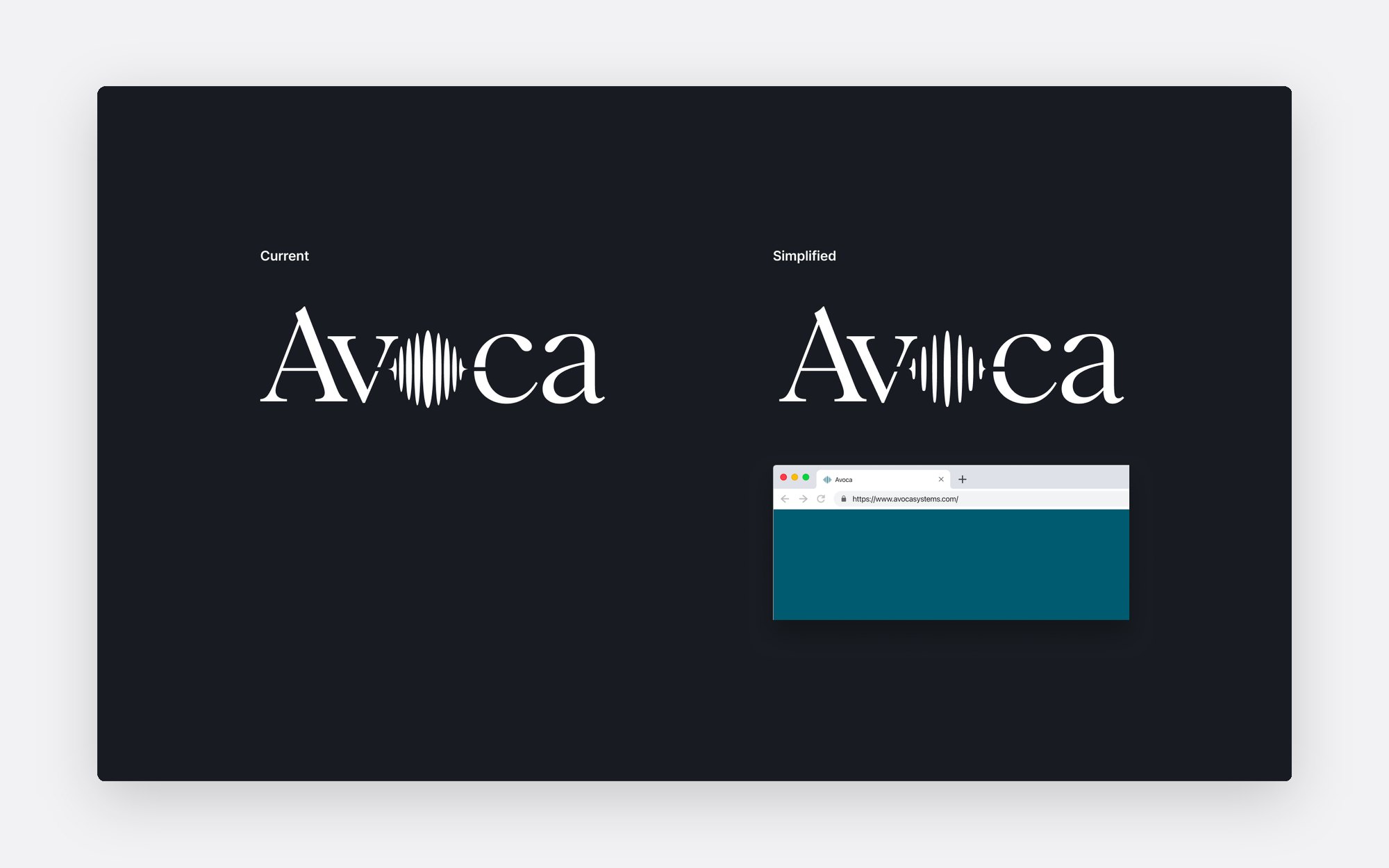
Soft glow, with Inset v2
Chosen as the visual direction.
19 October
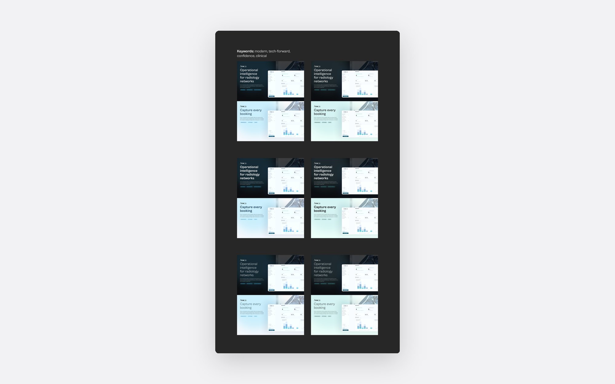
A 14px base and a ~1.2 type scale
Set with a co-worker.
29 October to 4 November
Five table review rounds
One table pattern, refined in Figma.
A 14px base suits dense operational screens, and a 1.2 scale makes a worklist quick to scan.
Type scale
Stepping up by about 1.2
- Step 535pxBookings this week
- Step 429pxResolved calls
- Step 324pxToday's worklist
- Step 220pxReferral received
- Step 117pxPatient called back about a booking
- Base14pxFax from the referring clinic, matched to an existing booking
One table pattern, two filter modes
Most of Avoca is tables, so one pattern covers them all.
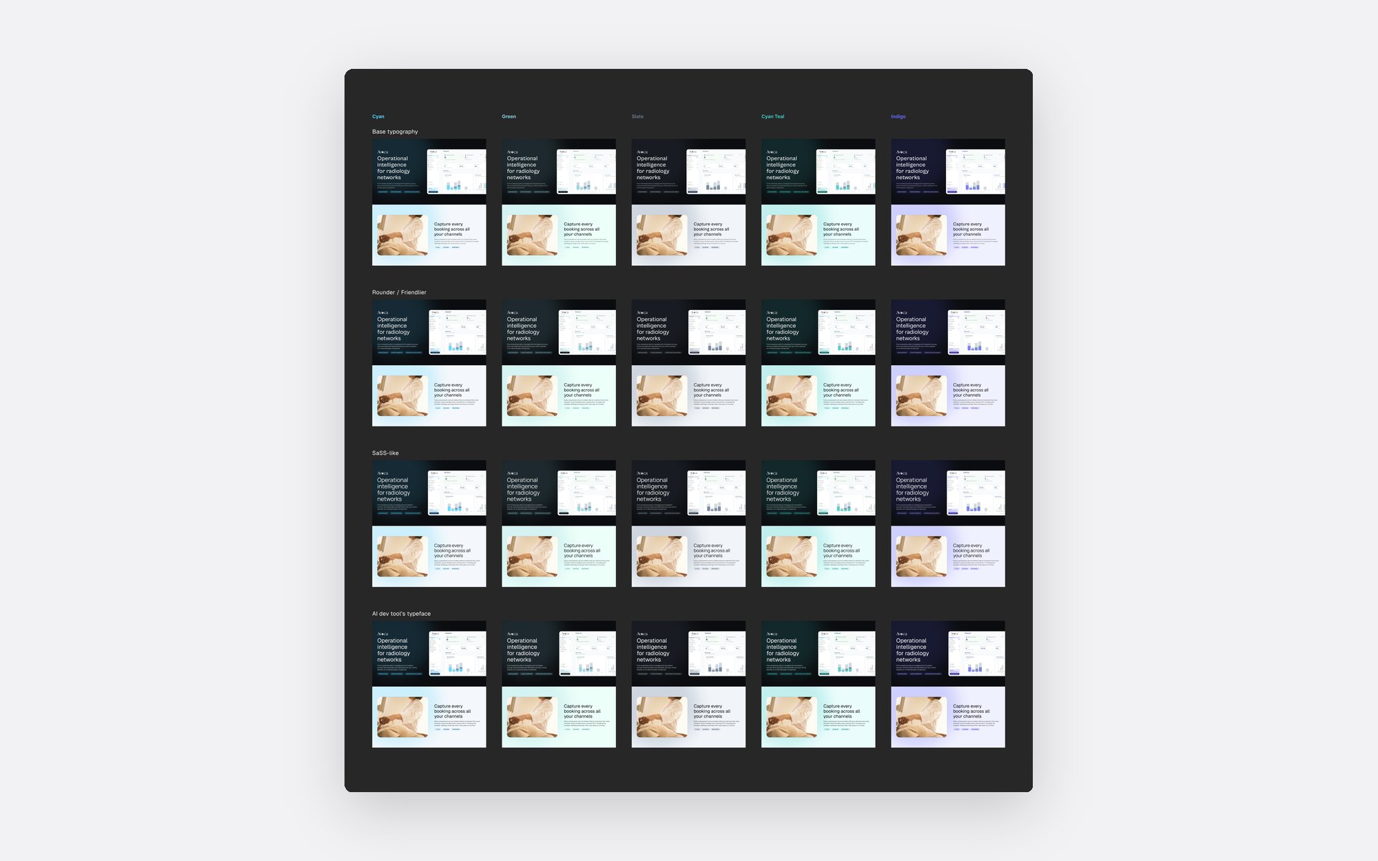
Default
Standard
For reading the rows.
Only when filtering is the work
Triage
For sorting the rows.
Next: service catalogue and rostering
Next, clinic managers will run their own rosters without Avoca in the loop.
The impact
Three weeks in
The direction, type scale and table pattern are agreed and moving into the product.
Reflection
Agree on the scorecard first
To bring order to a fast-moving product, agree on the scorecard first. Once it was written down, reviews became shorter and less personal.
Through Owlry