Canva — Settings Experience
Information architecture, Design systems, Research
Canva's settings had been left behind. The homepage and editor had been glowed up, enterprises had grown into organisations with dozens of teams, and settings was where the strain landed. With two co-workers, I drove the Settings glow-up: six milestones that turned a buried, inconsistent set of pages into one system. We ran 33 usability tests with 529 participants and took the work through LGTM with Canva's design leadership.
- Role
- Product Designer
- Team
- Admin Experience
- Timeline
- 2025
- Platform
- Web and mobile
529
participants across 33 usability tests
98%
average usability task success
31
clicks to switch teams
The problem
Settings is where teams are set up, and it had stopped working
Most tasks that make a Canva team successful happen in settings, from inviting people and assigning roles to single sign-on and billing. Yet settings had not changed for years.
Settings in November 2024
Five problems kept coming back
The same five problems came up in every review, support thread and research session.
Problem 01
Settings was hard to find
The Cycle 3 homepage glow-up had moved the cog into the user flyout.
Problem 02
Pages were inconsistent
Headers, widths, filters, spacing and calls to action all varied.
Problem 03
The navigation was out of date
Moving from Home into settings felt like changing products.
Problem 04
No cohesive grouping or labels
Categories were organised by role rather than job.
Problem 05
Organisations were poorly served
Admins had duplicated pages and switched teams one at a time.
Admins are the people who grow Canva
A team that is set up well grows into more paid seats. A team that is set up badly quietly stalls.
45% more active
Teams with an engaged admin are 45% more active than teams without one.
Cheerleaders
Admins champion Canva in their companies and schools.
Decision-makers
Admins usually decide to buy and renew Canva.
Critical setup tasks, by share of successful teams
Tasks within settings Tasks outside settings
Moving the cog made it worse
After the cog moved into the flyout, every measure of settings moved the wrong way.
After the cog moved into the user flyout
- −30%
Users visiting settings
- −17%
Users changing a setting
- −31%
Members added to groups
- +27s
Time from Home to a first settings change
- +18%
Support tickets about configuration
My role
We designed the frame, and other teams furnished the rooms
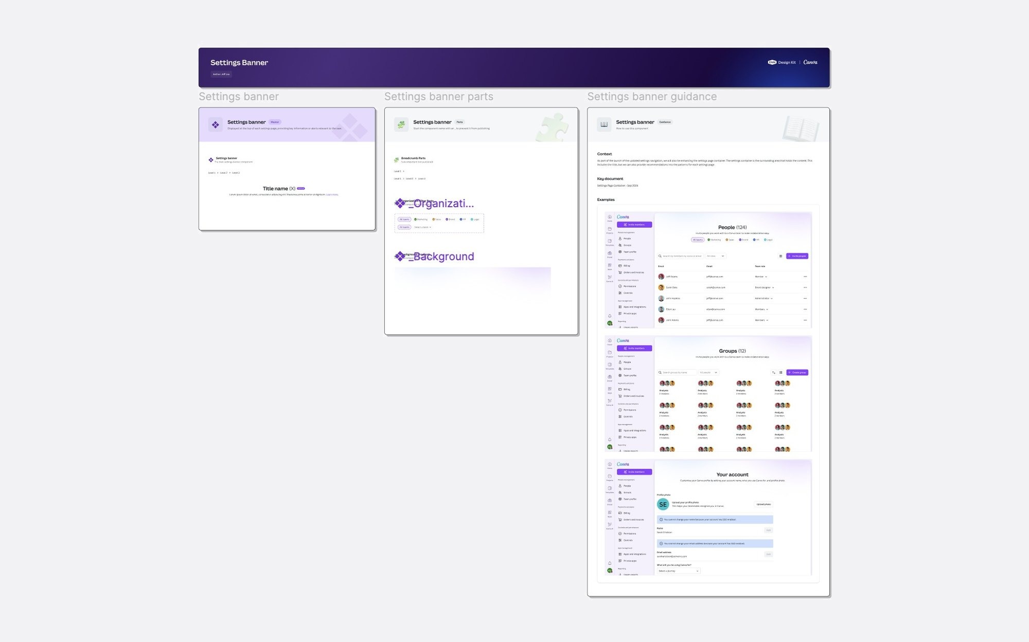
I was one of three drivers of the glow-up and owned the LGTM deck for Canva's design leadership. I led discoverability, the page container, the navigation and the organisation experience, and shaped the information architecture with a co-worker. The pages themselves belong to dozens of other teams.
What we owned
The frame
- Where settings lives and how it is reached
- The page container every page sits in
- The navigation and the information architecture
- The organisation experience
What other teams owned
The rooms
- Brand, billing, security and apps
- Reports, domains and approvals
- Every page's content and controls
- Dozens of features, each with its own team
So much of my job was alignment: with the homepage team on where settings lives, with search and the design system on shared patterns, with the owners of brand, billing, accounts, apps and websites on where their pages would move, and with Growth on onboarding. Every decision went into a decision log with its options, evidence and a recommendation, so teams outside the room could see why. I also owned the Settings Experience design kit in Figma.
The process
Six milestones, one programme
Rather than one enormous redesign that never shipped, we broke the work into six milestones, each with its own problem statement, research and decisions, so engineering could build what was ready while we kept learning.
Discoverability of settings
Where settings lives.
A glowed-up page container
One anatomy for every page.
Updated navigation
Settings that feels like Canva.
Recategorisation and naming
An IA built around jobs.
Team management for organisations
One place for every team.
The visual language inside pages
One look inside every page.
The milestones overlapped between September 2024 and April 2025.
Research at every step
Research ran alongside the design, and every test had to reach Canva's "all greens" usability bar before the work moved on.
- 33
Usability tests
- 6
Milestones
- 529
Participants
- 98%+
Average task success
Milestone one · Discoverability
Put settings back where admins look for it
The first question was the most political: where should settings live? The homepage glow-up had simplified the global navigation, and the cog had been a casualty.
Problem 01
It hinders admin productivity
Admins pay every extra click on every visit.
Problem 02
It slows down user management
Inviting, roles and groups all start in settings.
Problem 03
It holds back scale
Teams that are not set up well do not grow.
Testing the cog against the flyout
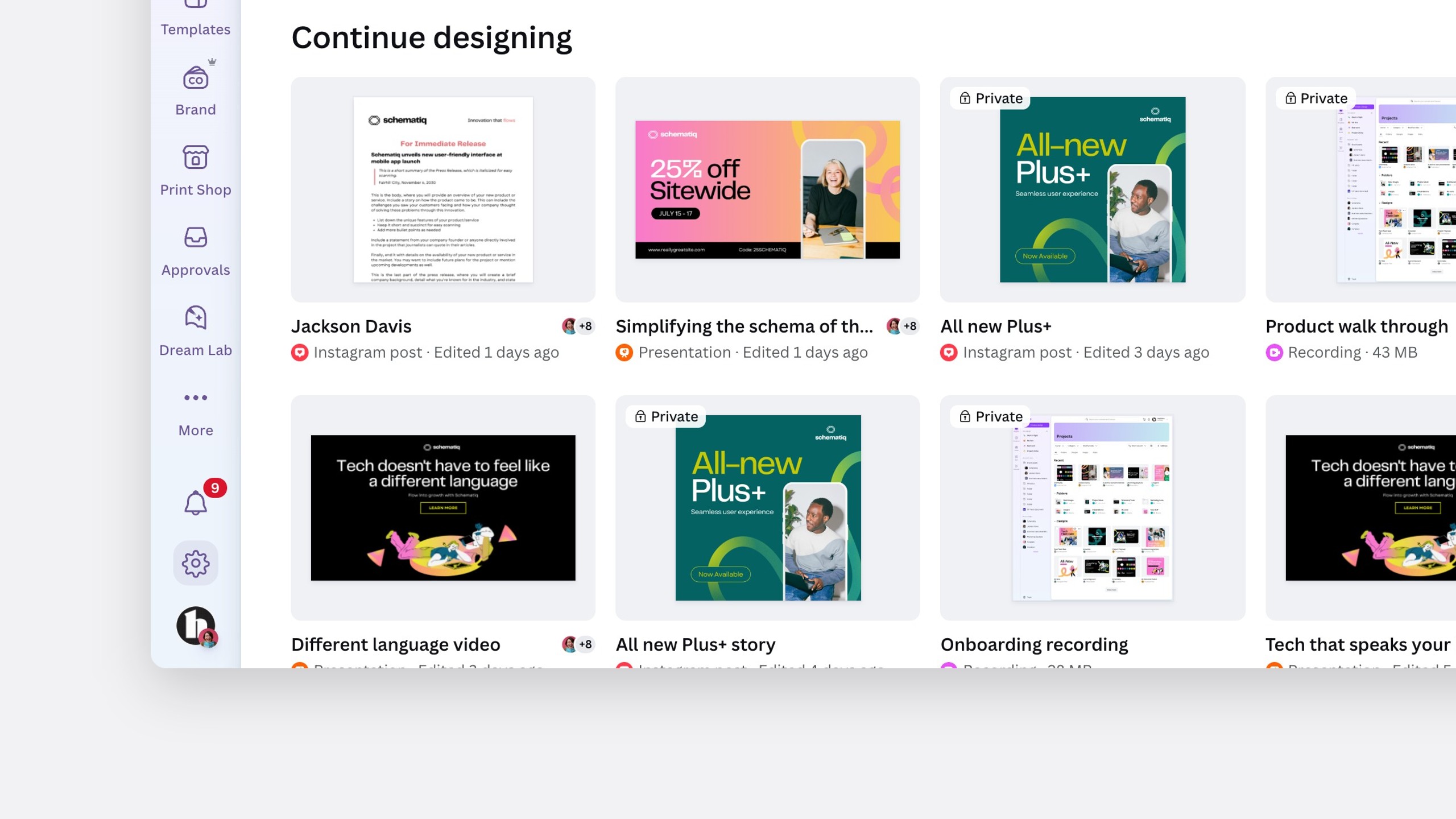
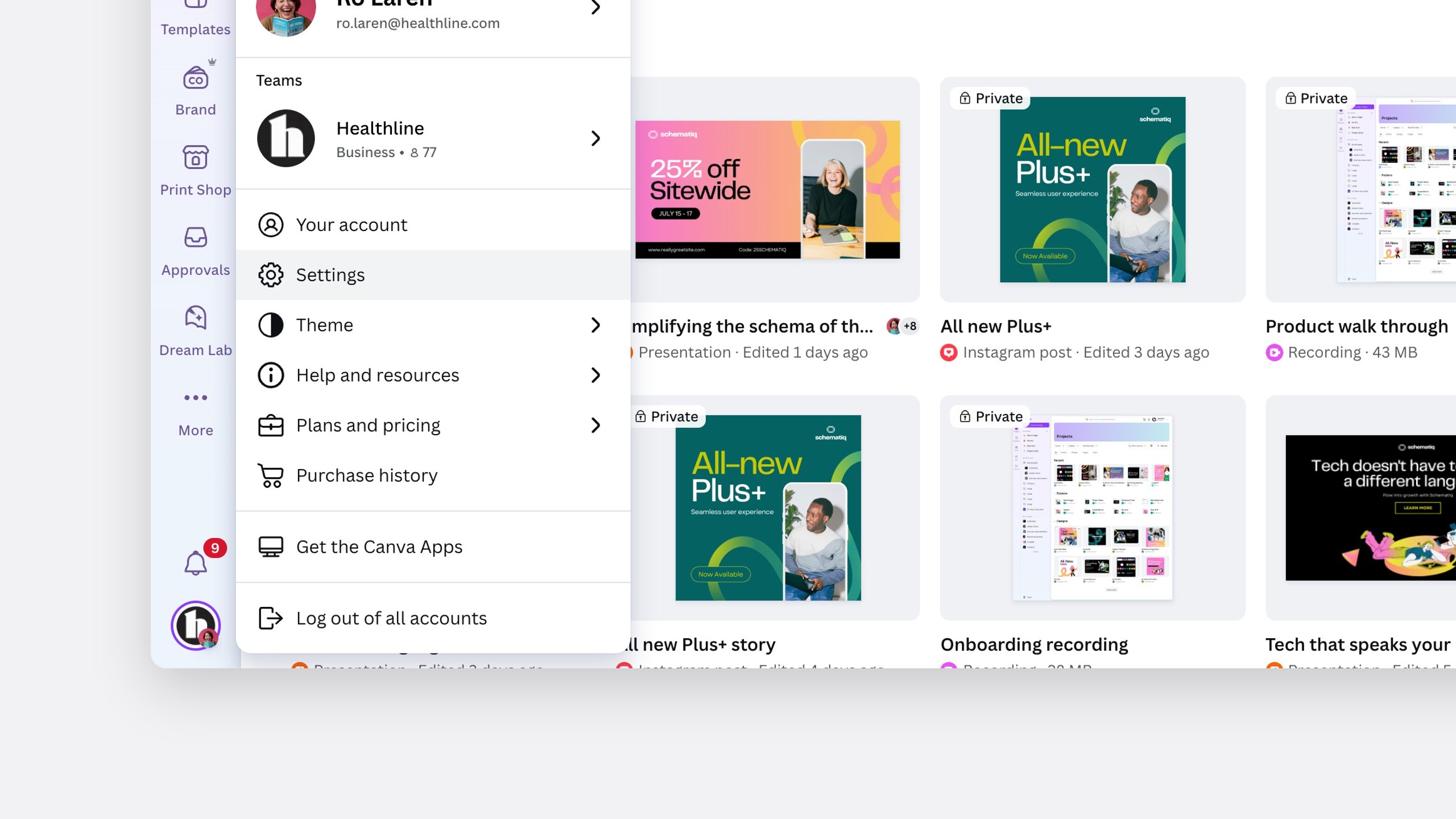
We ran an A/B usability test of the cog in the global navigation against settings in the user flyout.
A · Cog in the global navigation
B · Settings in the user flyout
Findings
The cog was clearly more intuitive
20sfaster on average to reach settings with the cog
The cog took fewer steps, and passed the all-greens bar with 20 participants.
The flyout caused mixed feelings and confusion.
I had to click through a few more steps than before.
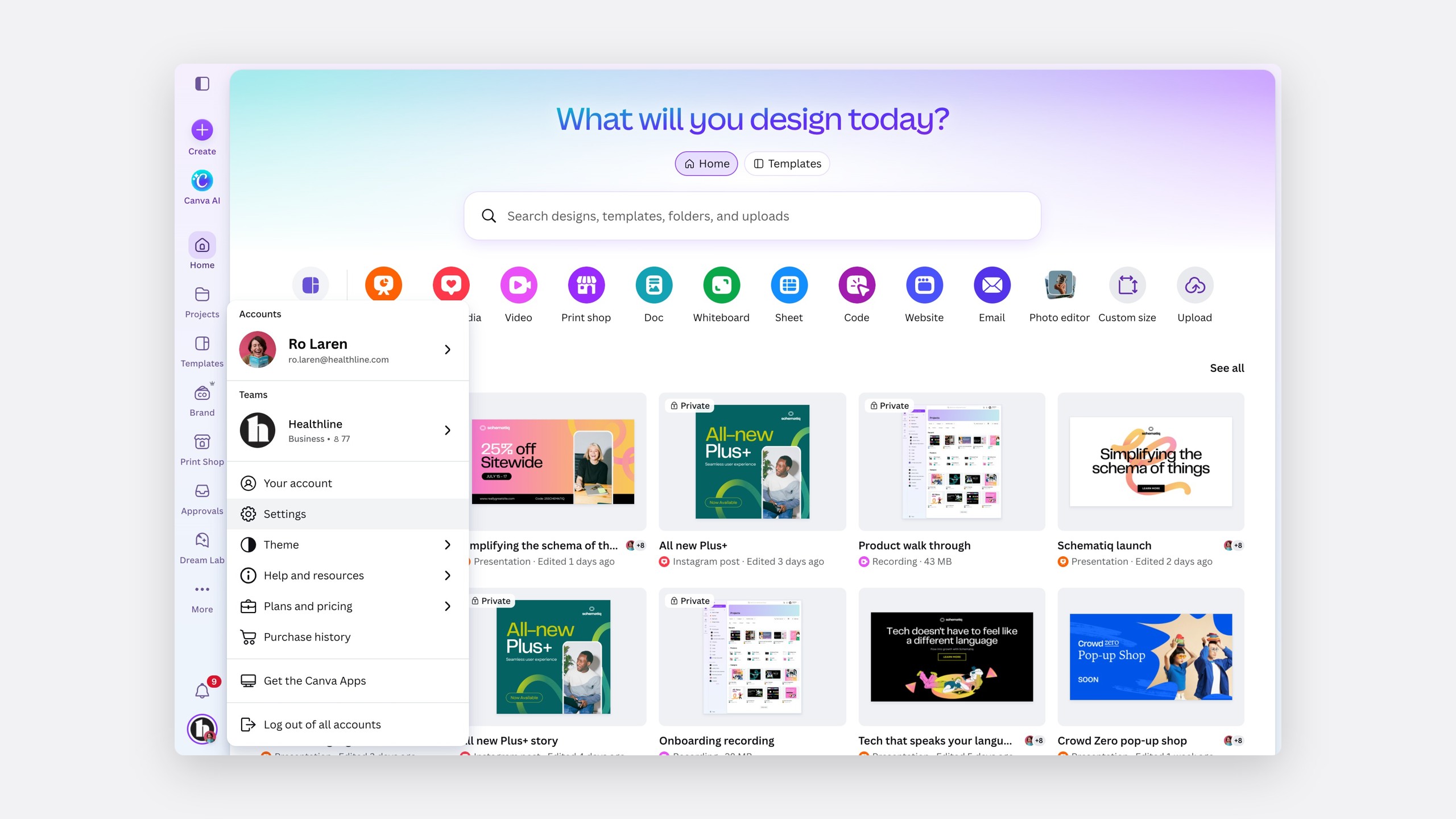
But the global navigation could not take every item that wanted a place. With the homepage team, we simplified the user flyout and gave settings a prominent place in it.
Settings, placed prominently in a simplified flyout
Milestone two · The page container
One anatomy for every settings page
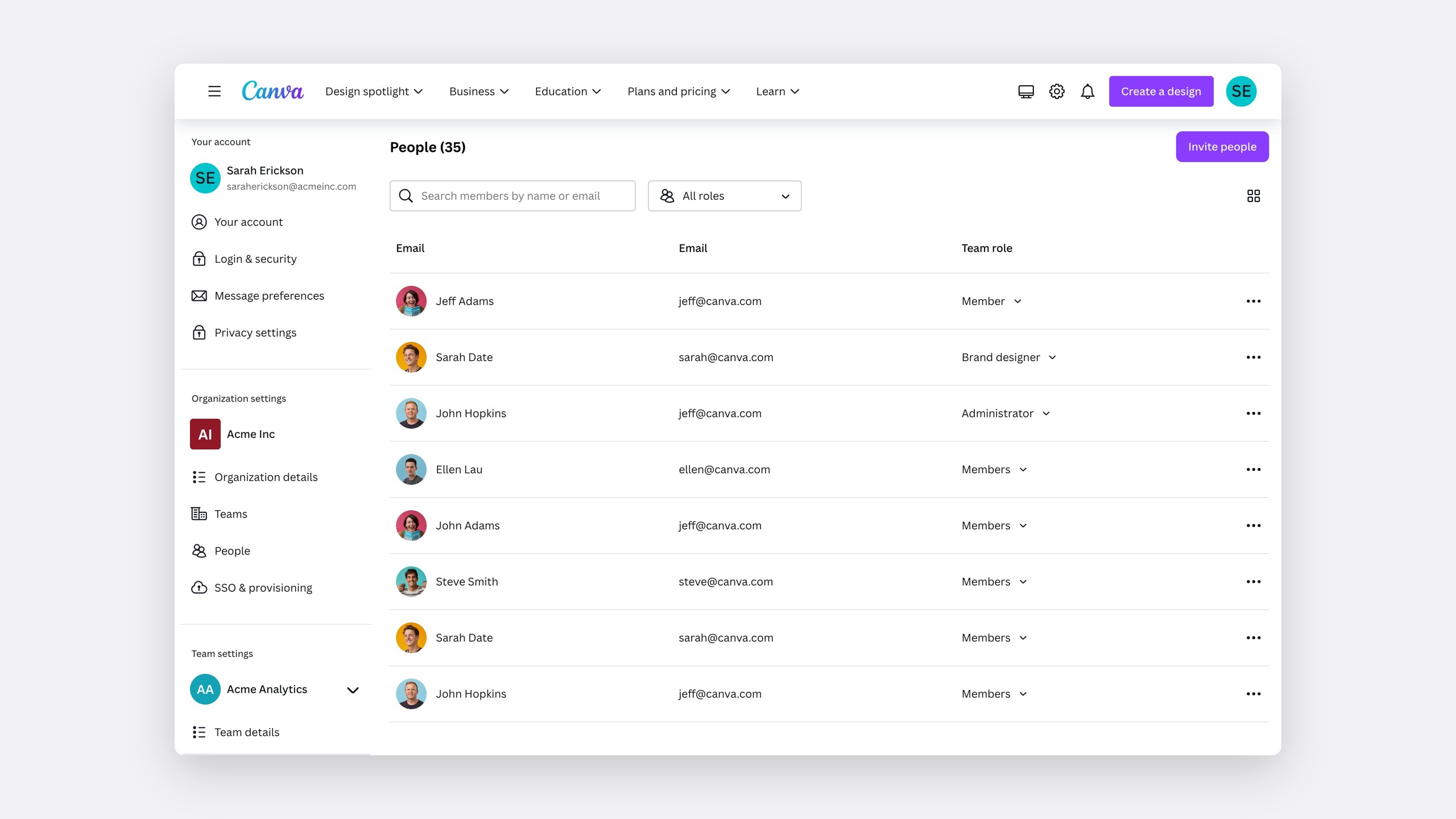
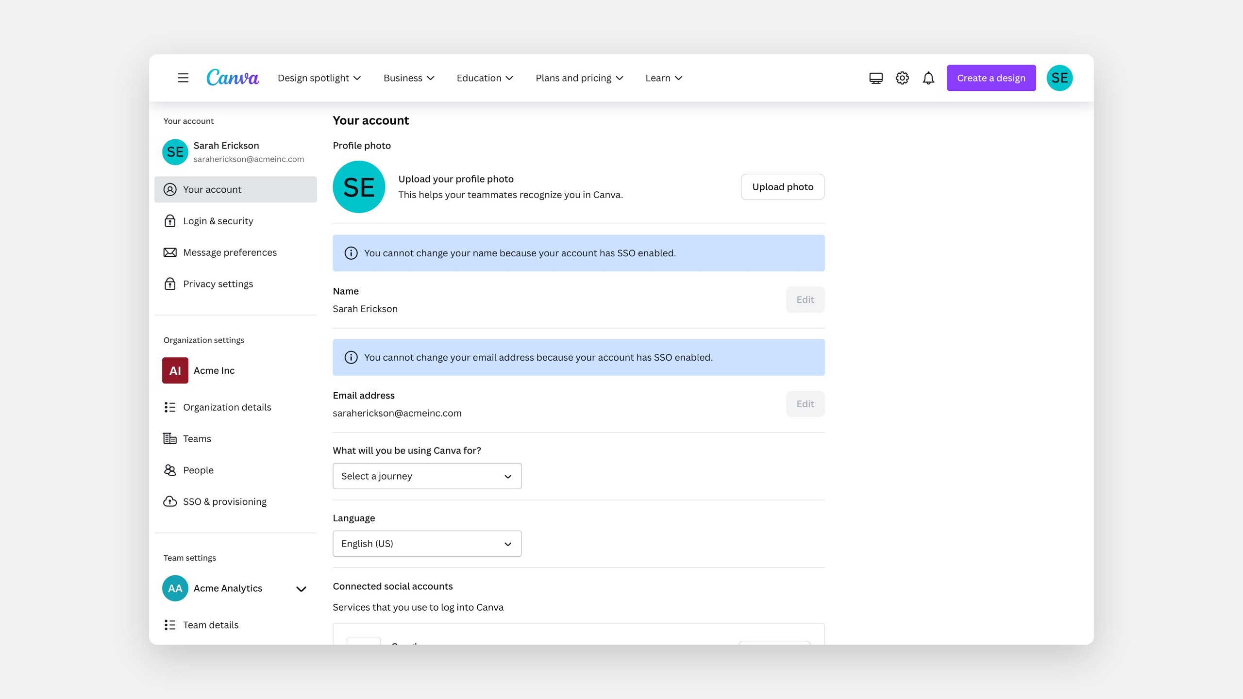
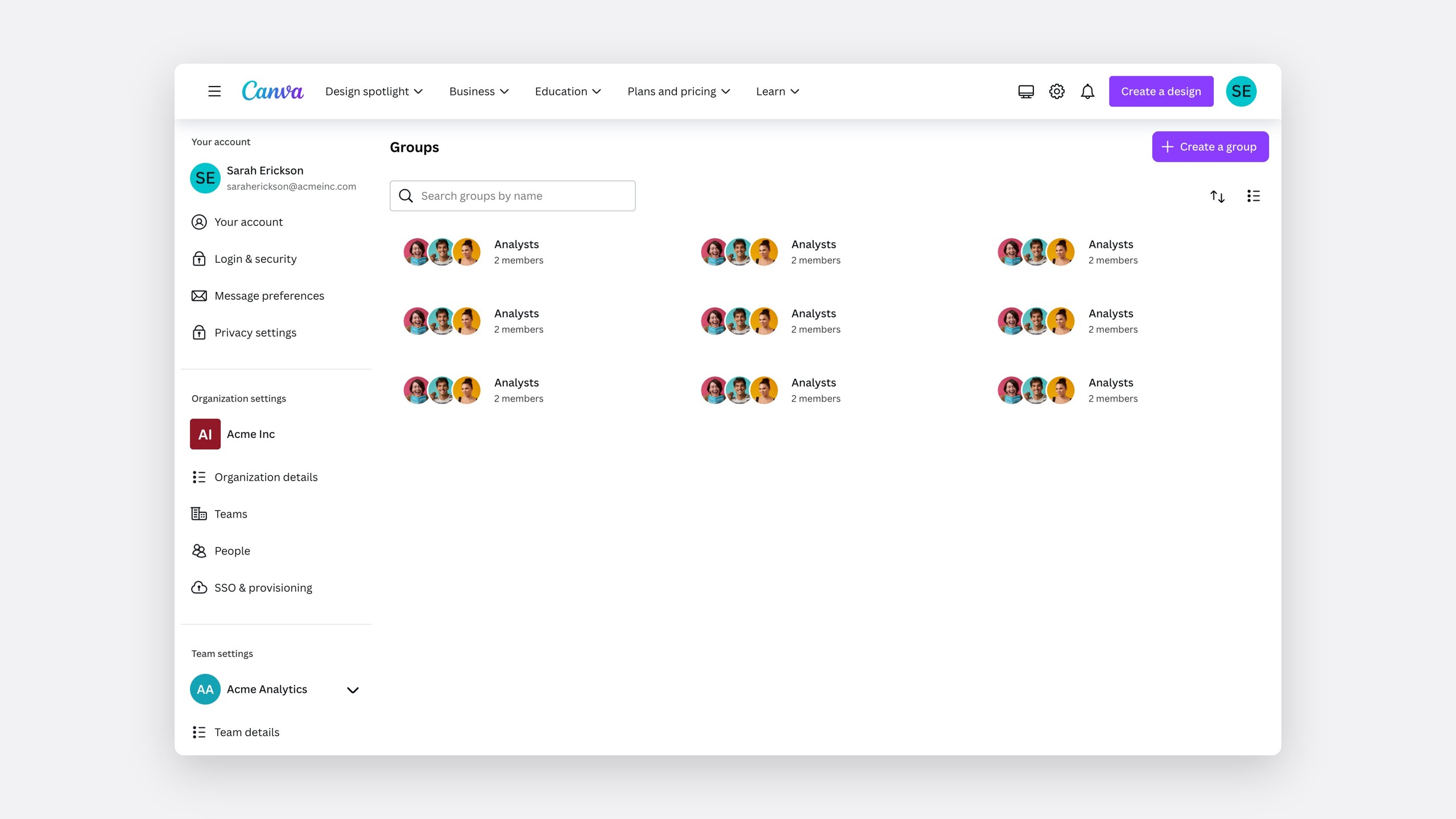
Every settings page sits inside a container. Ours was outdated, and no two teams used it the same way. Auditing every page, we found the same six inconsistencies everywhere.
What the audit found, on almost every page
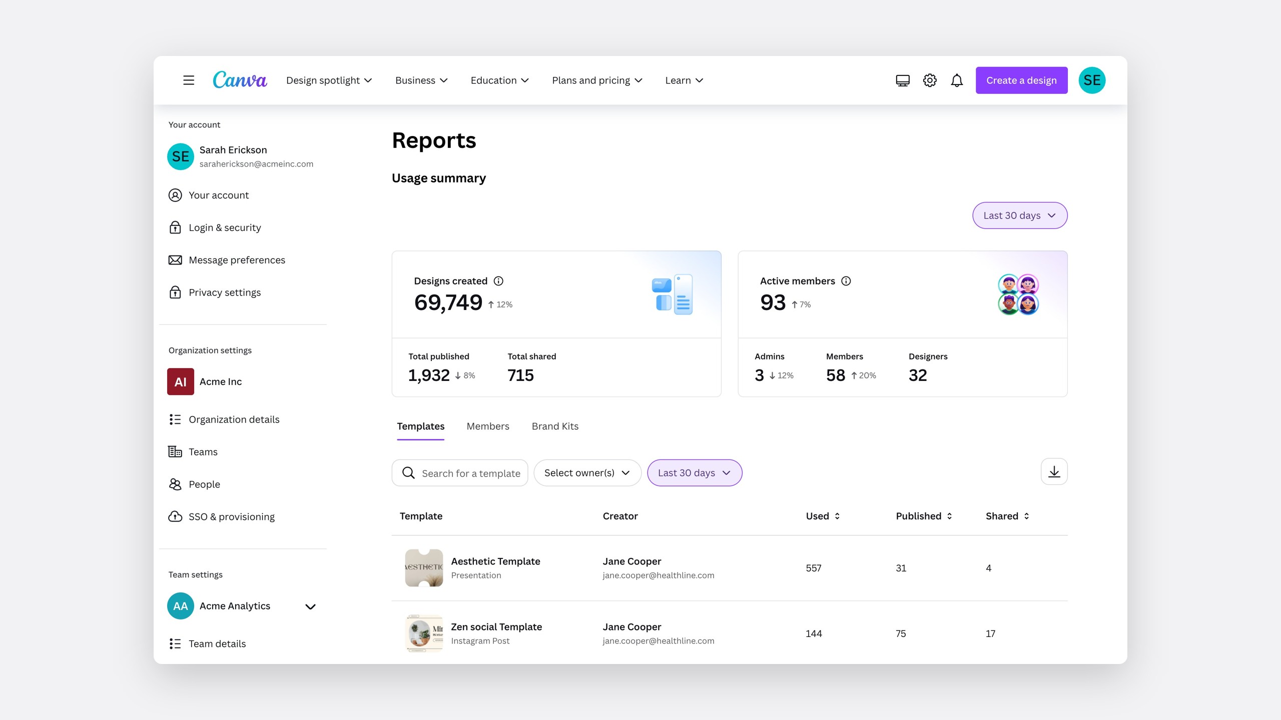
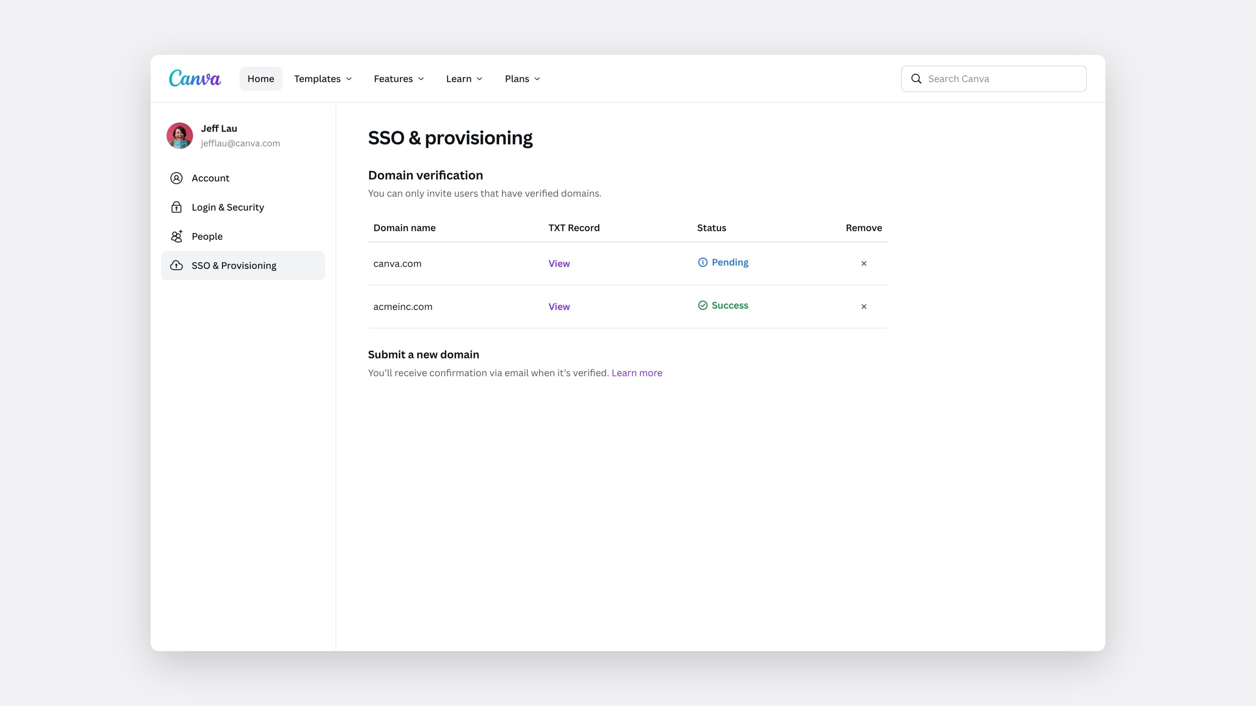
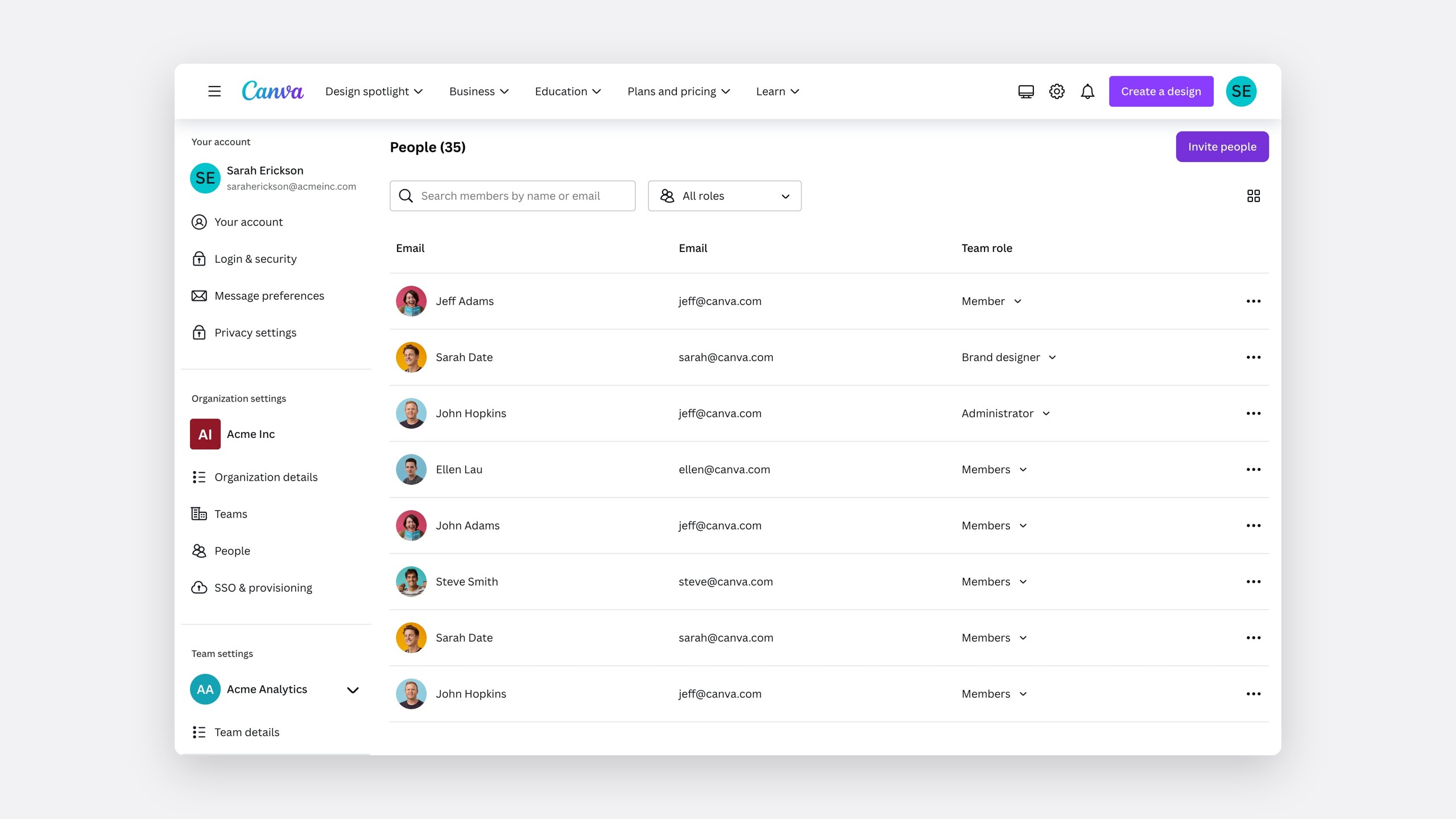
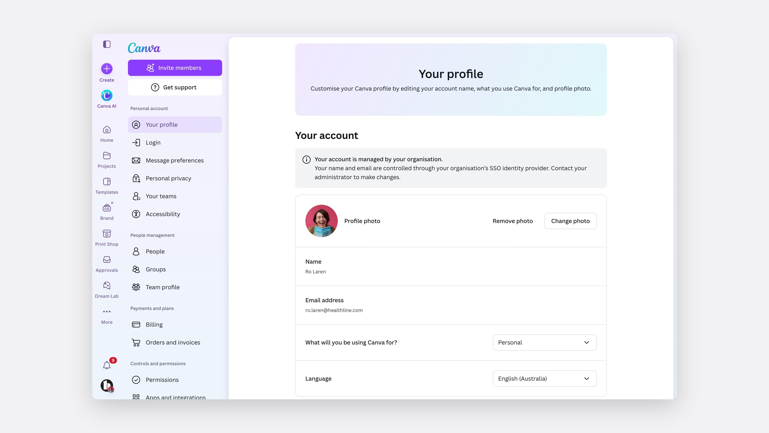
A revamped container
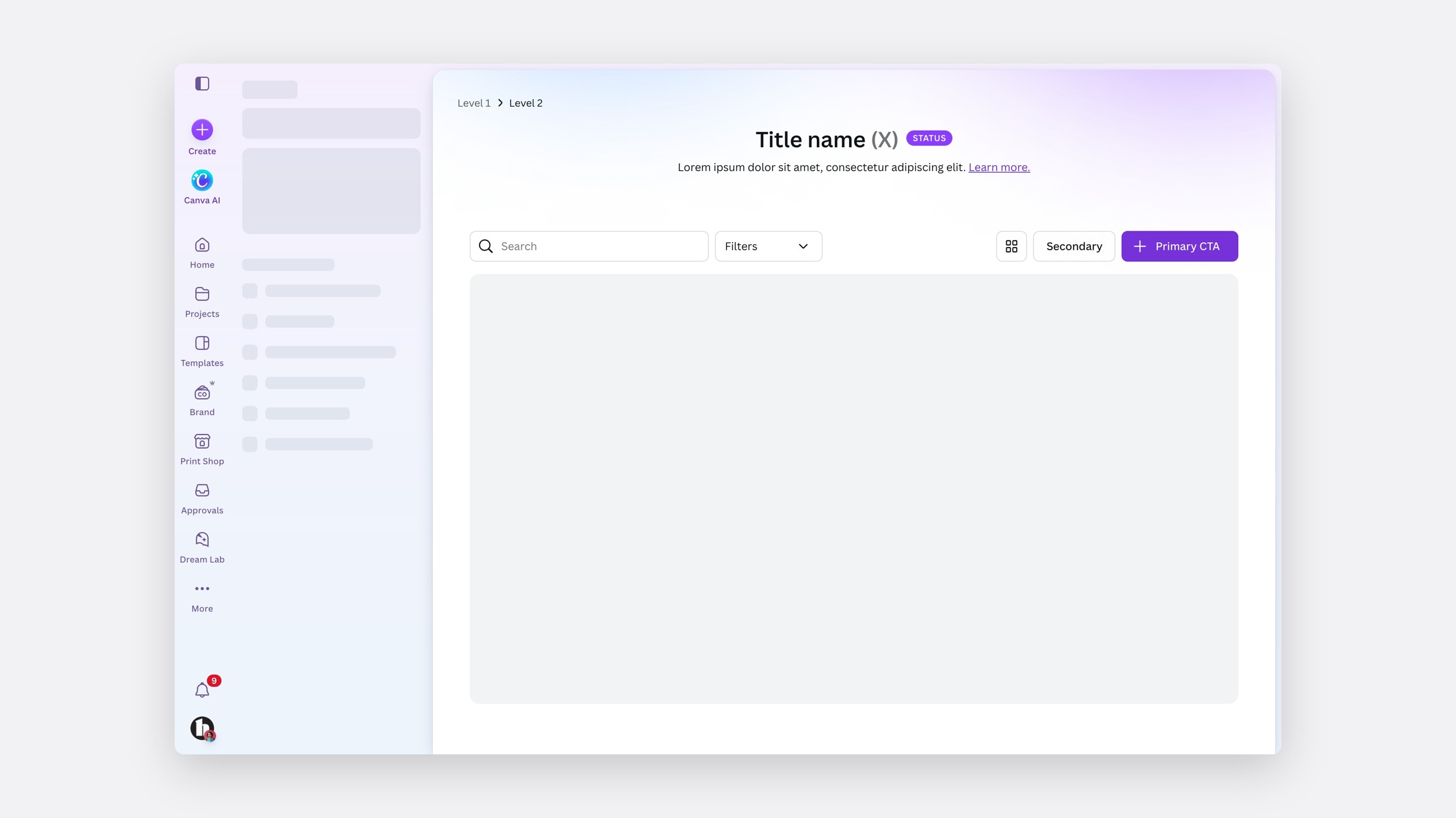
- 1
BreadcrumbsShow where you are, from the second level down.
- 2
TitleThe page name, with a count where it helps.
- 3
StatusMarks a page as beta or new.
- 4
DescriptionExplains what the page is for.
- 5
FiltersNarrow the content with search and filter pills.
- 6
ViewsSwitch between list and grid.
- 7
ActionsSit in the same place on every page.
- 8
ContentTables, controls and anything else the owning team needs.
Every detail was a written decision
With so many teams building into it, no part of the container could rest on taste.
Maximum width
768px for controls.
Two widths
Full width for tables.
Left-aligned
Under the navigation.
Search and filter
Shared with search and design system.
Header banners A banner matches the rest of Canva without pushing the content down.
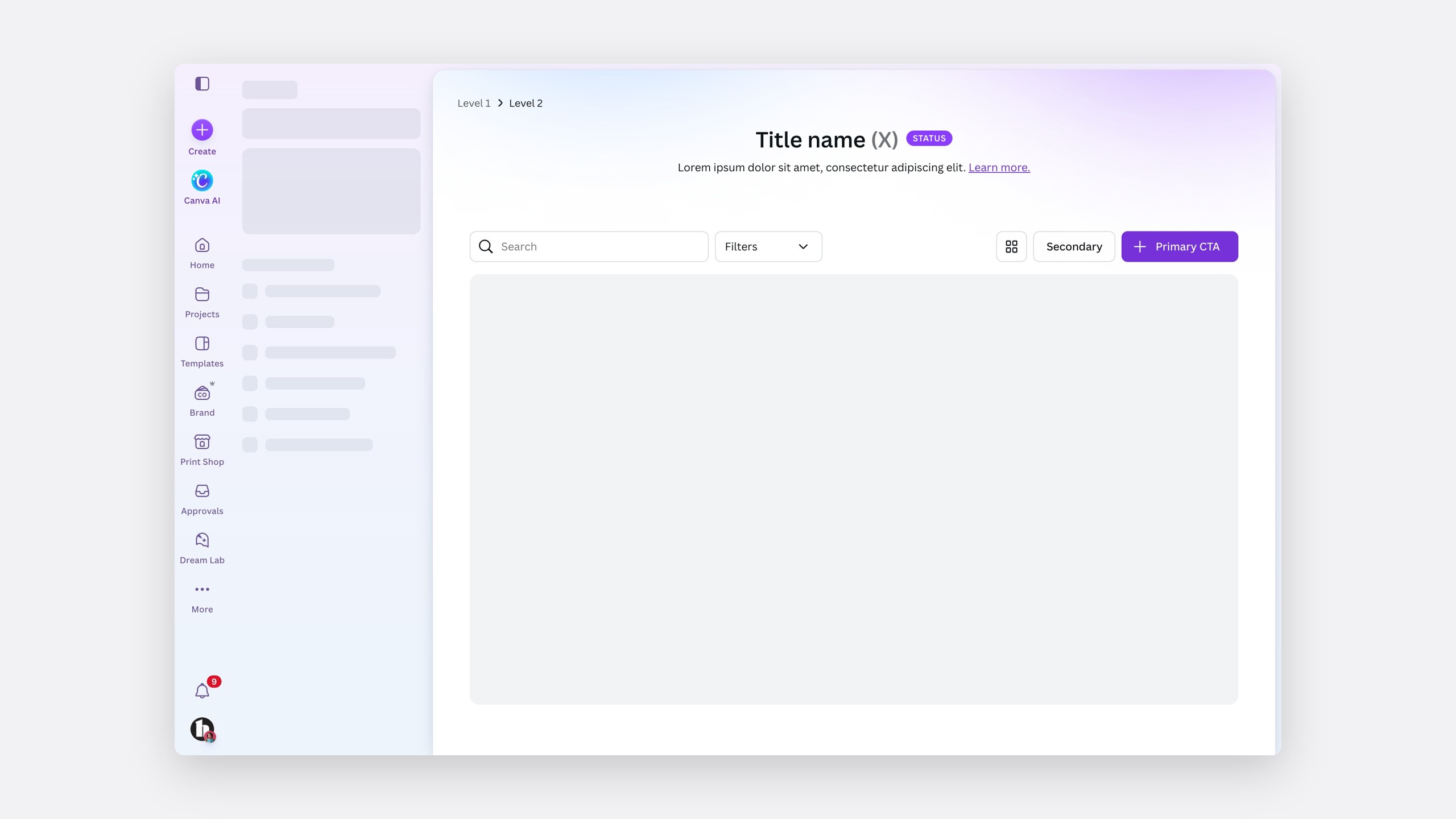
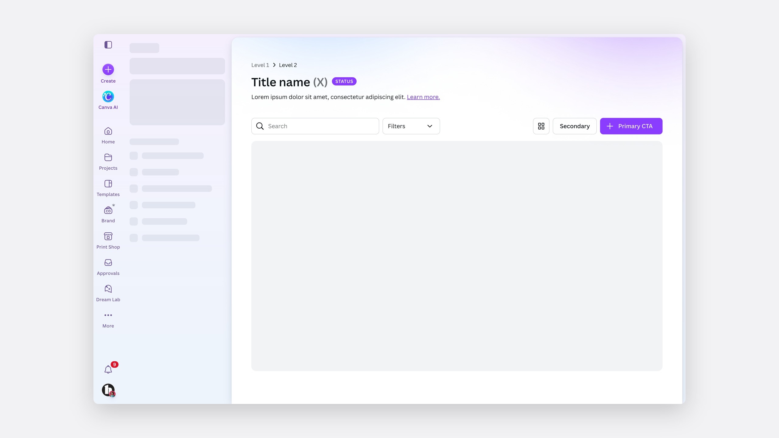
Breadcrumbs only from the second level Most pages have no subpages, so a first-level breadcrumb has no purpose.
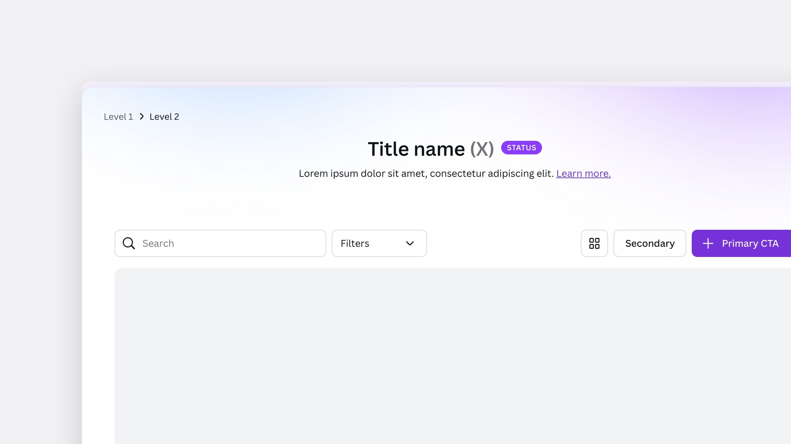
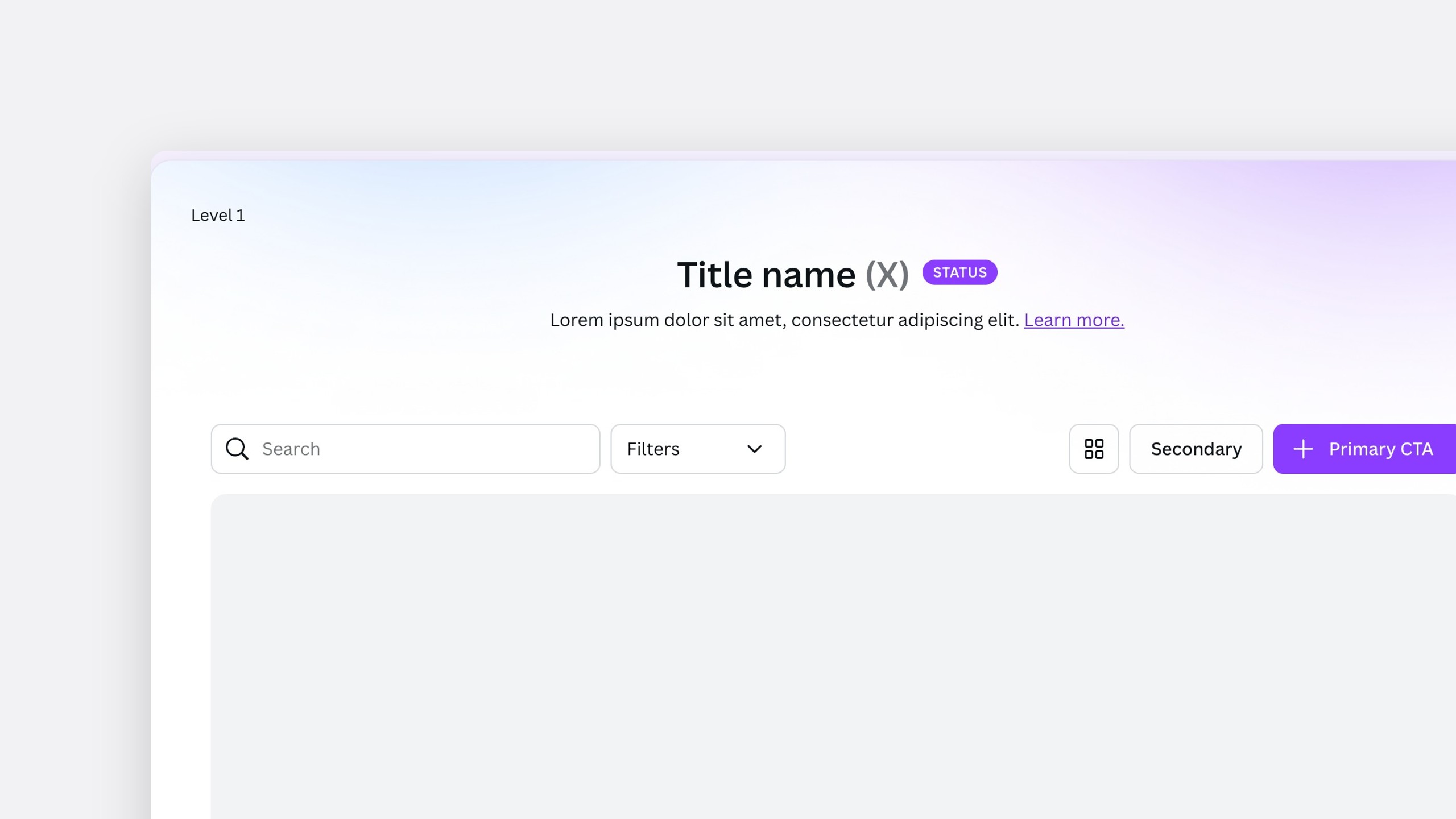
Counts in the title "How many members are in my team?" is a top admin question, so the title answers it.
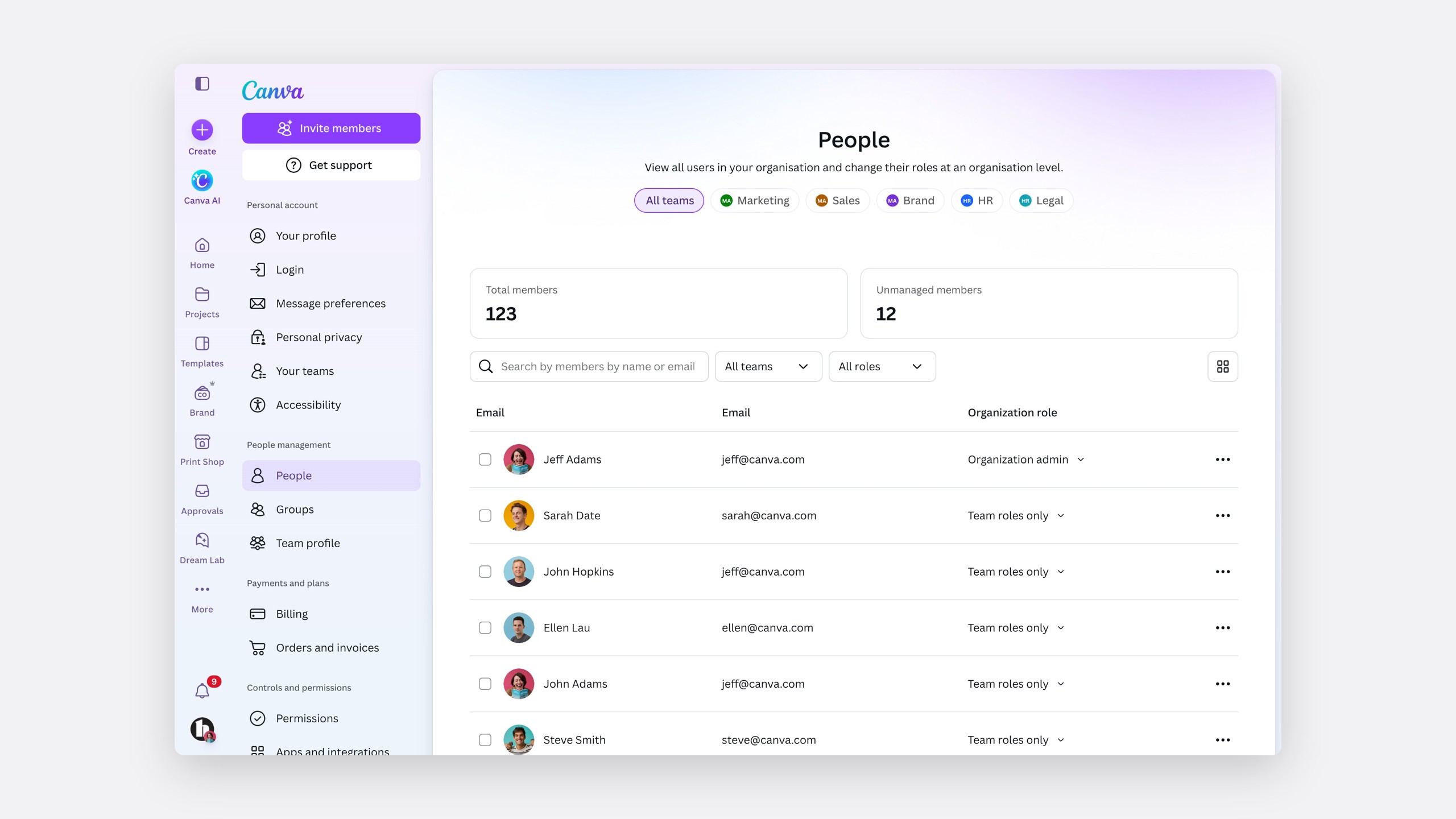
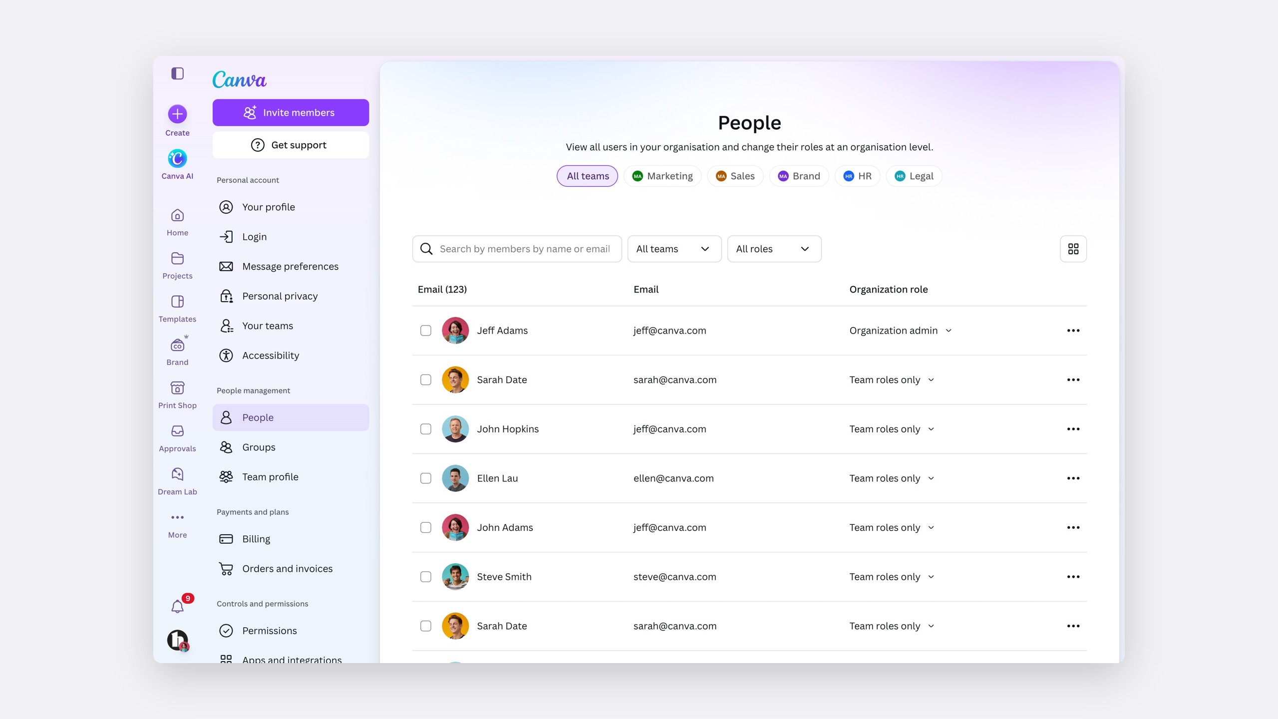
Empty space at wide widths A full-width banner over narrower content matches how Canva handles wide screens.
The 768px cap on controls works across the three most common screen widths.
Share of screens, by width
Between 1366px and 1920px
Smaller than 1366px
Larger than 1920px
Most common screen widths
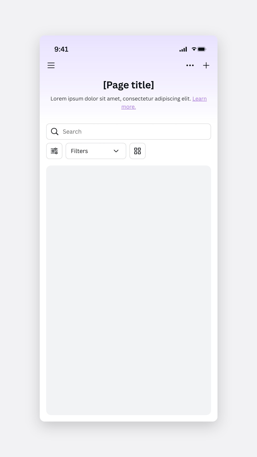
On mobile, the container follows Projects.
The mobile settings container
Before and after
 BeforeAfter
Milestone three · Navigation
Make settings feel like the rest of Canva
Settings navigation had been untouched for years, and next to the new homepage it was jarring.
Problem 01
Visual and interaction inconsistencies
It did not look or behave like Canva.
Problem 02
No room for structure
It could not show hierarchy.
Problem 03
Core tasks were hard to reach
Inviting members and getting support were buried.
We scoped this as a UI update on the existing information architecture, so engineering did not wait for the harder restructure.
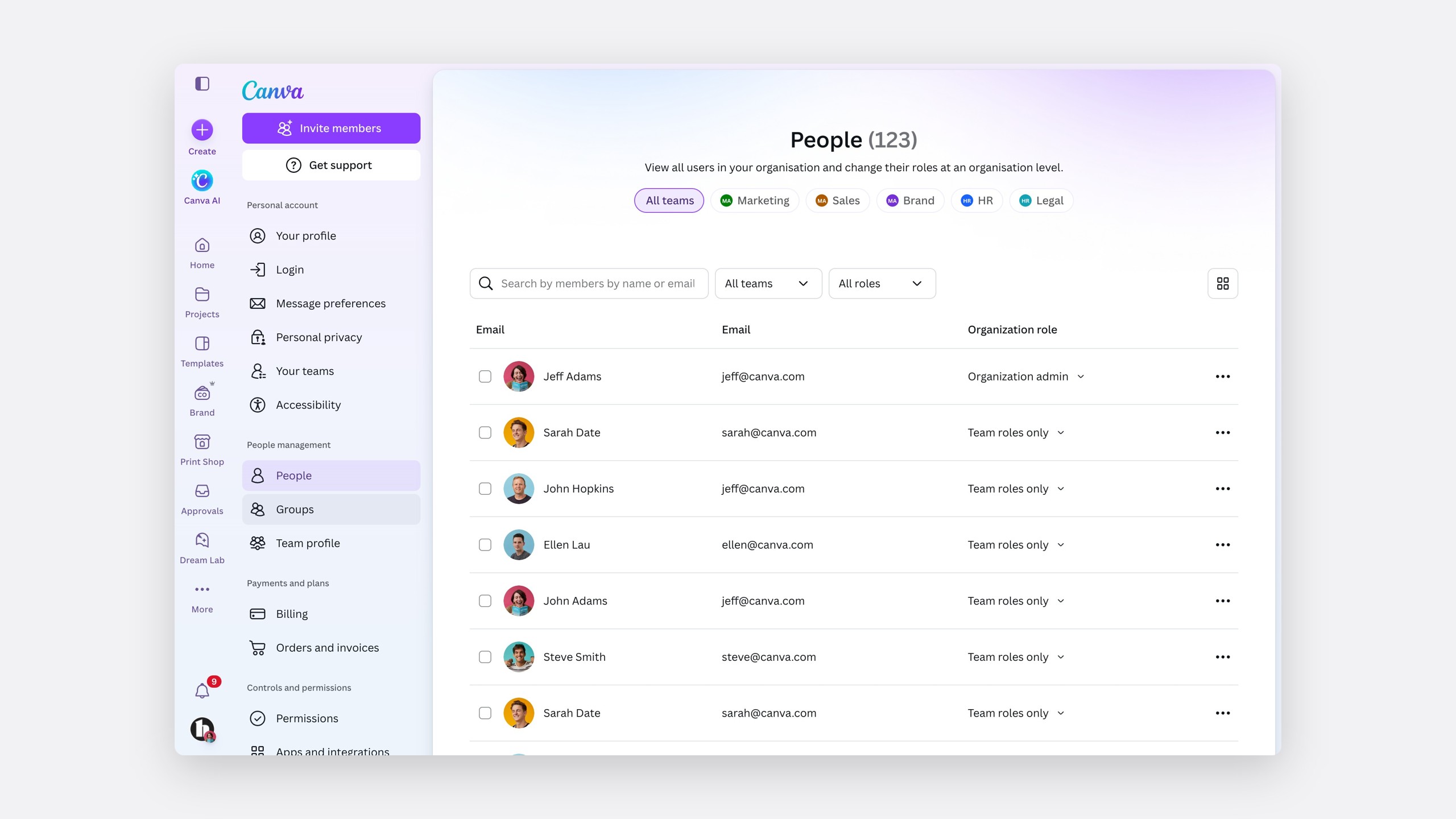
A navigation that mirrors the homepage
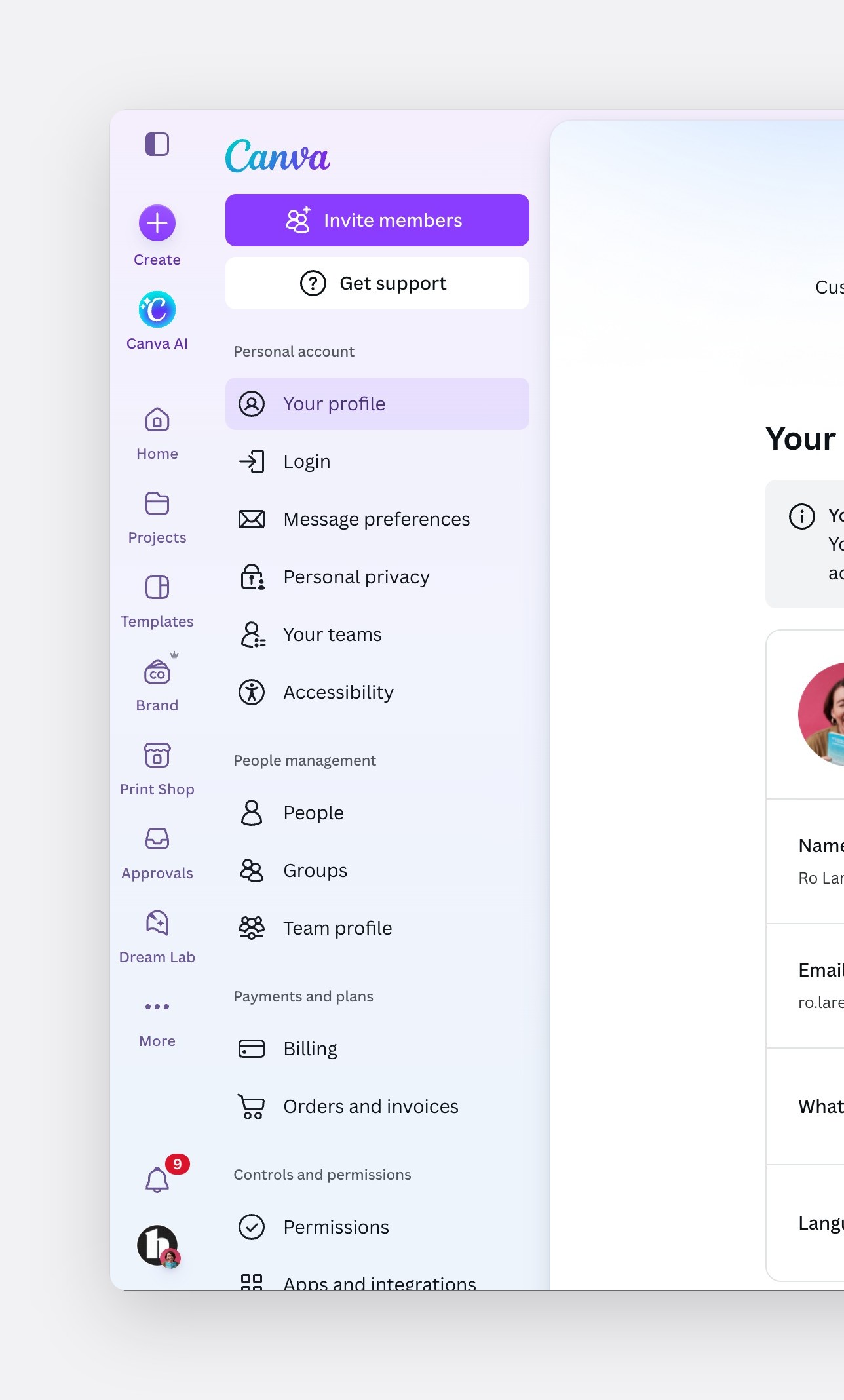
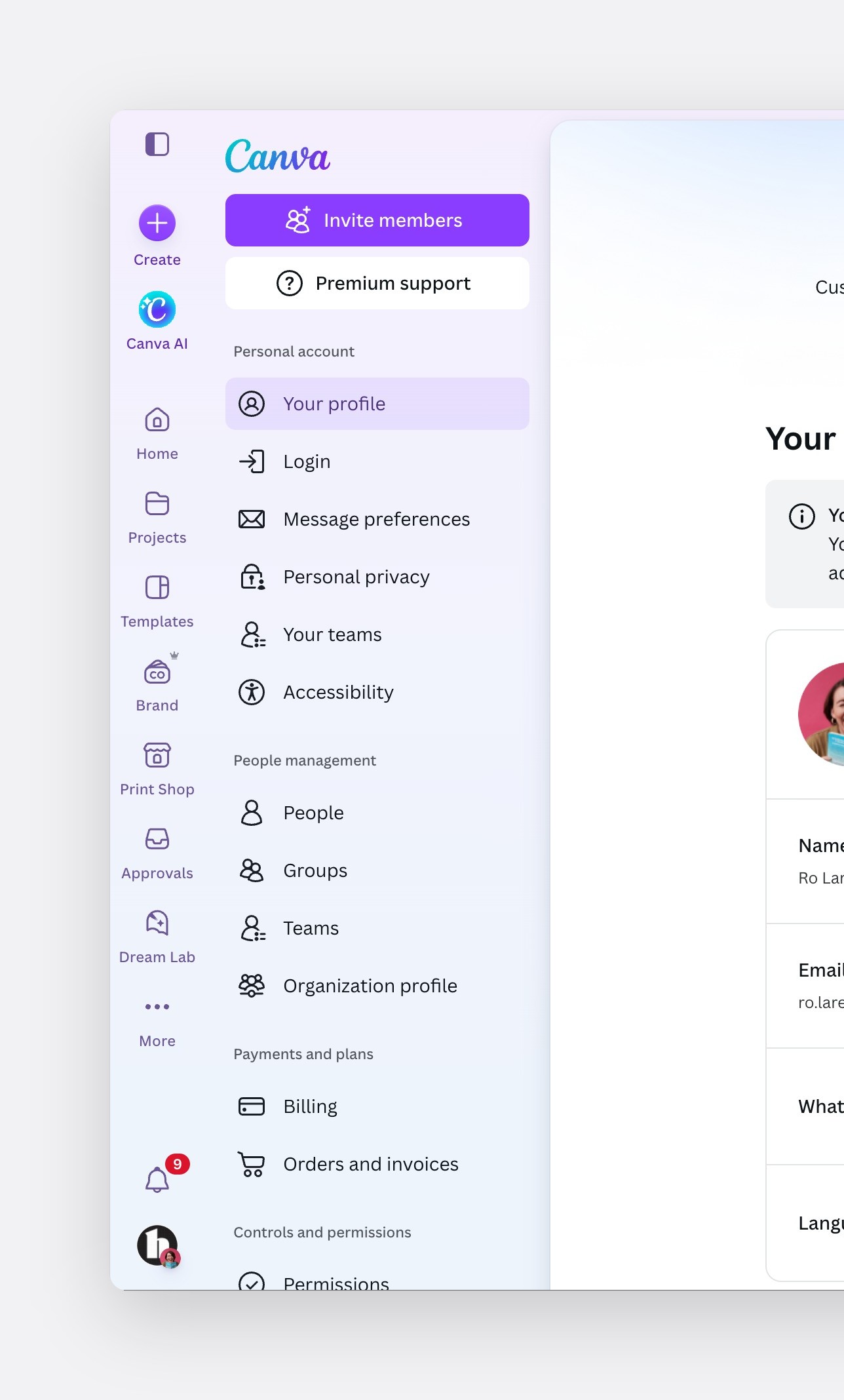
The new navigation uses the homepage's primary navigation, labels, tabs and gradient. Inviting members became the primary action, because it matters most to admins, with Get support, or Premium support for enterprises, second.
The glowed-up navigation
Decision
Label, tab, sub-tab
One navigation architecture, with room for hierarchy.
Decision
Onboarding to Growth
Onboarding inside settings went to the Growth team.
Decision
No bottom sheet
On mobile, settings opens as a page.
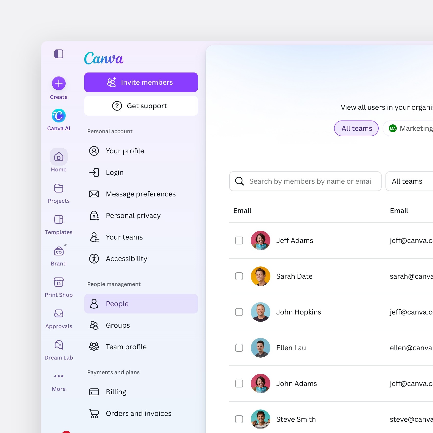
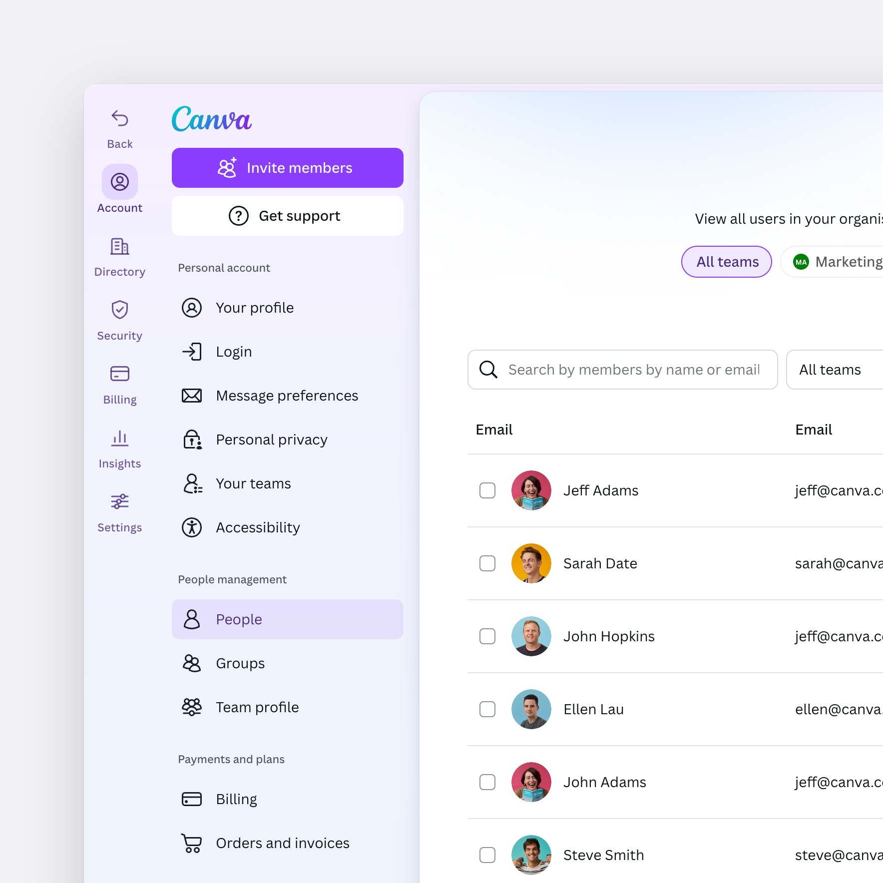
Where settings lives
We explored a separate settings navigation. In research with 15 participants, people found it confusing, and the homepage team wanted one global navigation. So settings stayed inside Home.
Inside Home's navigationRecommended
A custom settings navigation
Scaling across every plan
Solo
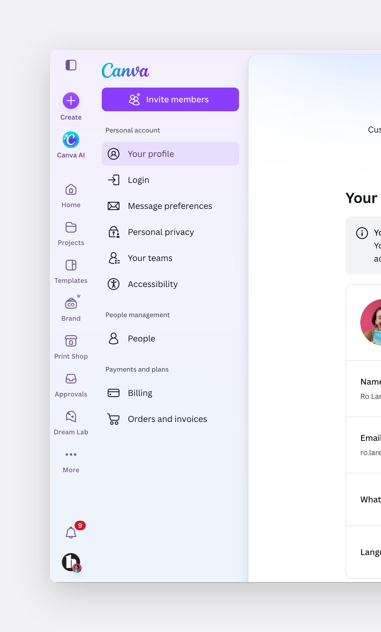
Canva for Teams
Organisations
What testing showed
Usability testing, 15 participants
The navigation passed all-greens testing
15/15 found it appealing and consistent with Canva.
14/15 easily found Get support and Invite members.
13/15 noticed a tab's notification badge.
A Get started list confused people, so we handed onboarding to Growth.
Milestone four · Information architecture
Organise settings by the job, not by the role
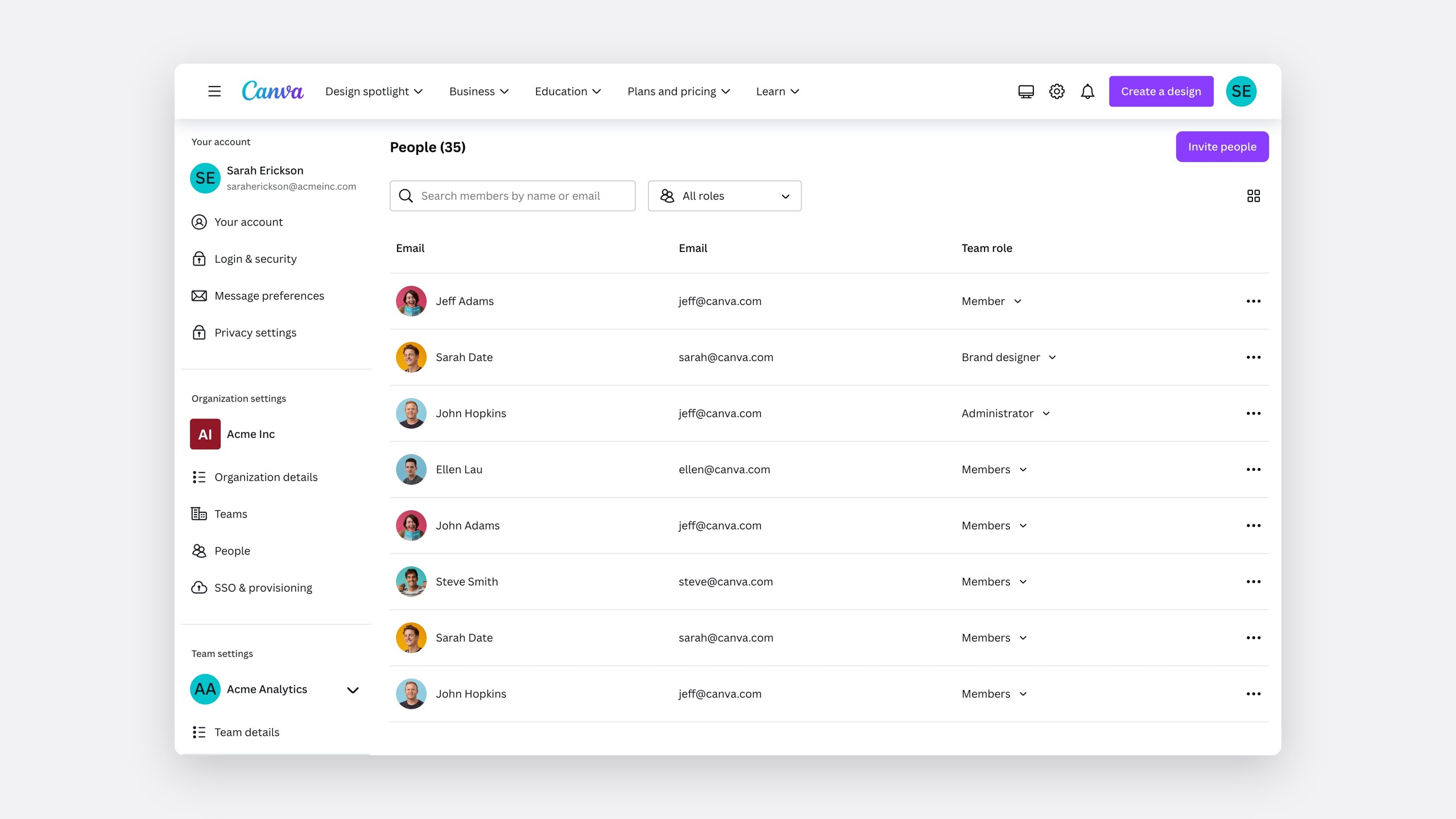
The old information architecture split pages into those that affect you, the organisation or one team. It made sense to its builders, not to admins.
Problem one
Duplicate pages
An organisation and each team had their own People page, Groups page and so on.
Problem two
One team at a time
Admins switched teams individually, leaving the page they were on.
Switching teams, one at a time
Principles first
Principle
Cluster by job to be done
Not by role type.
Principle
Consistent naming patterns
Such as nouns over verbs.
Principle
The essence in the name
Set the right expectation.
Principle
Scale across every plan
Add or remove pages by plan.
Principle
Nest one level, at most
Focus on levels one and two.
Principle
Leave page content alone
Focus on categories and names.
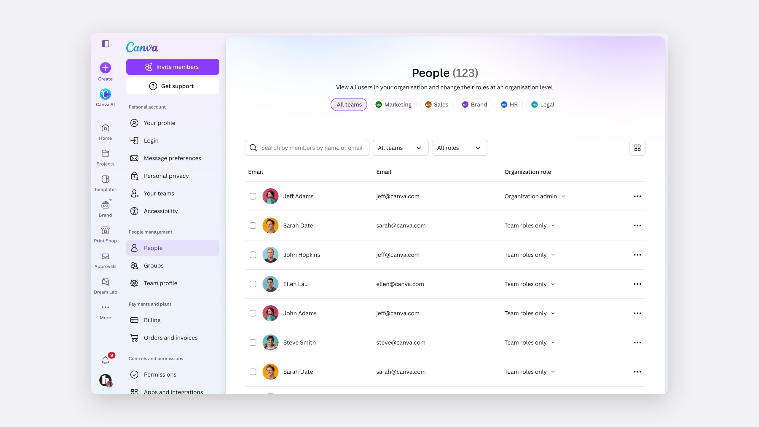
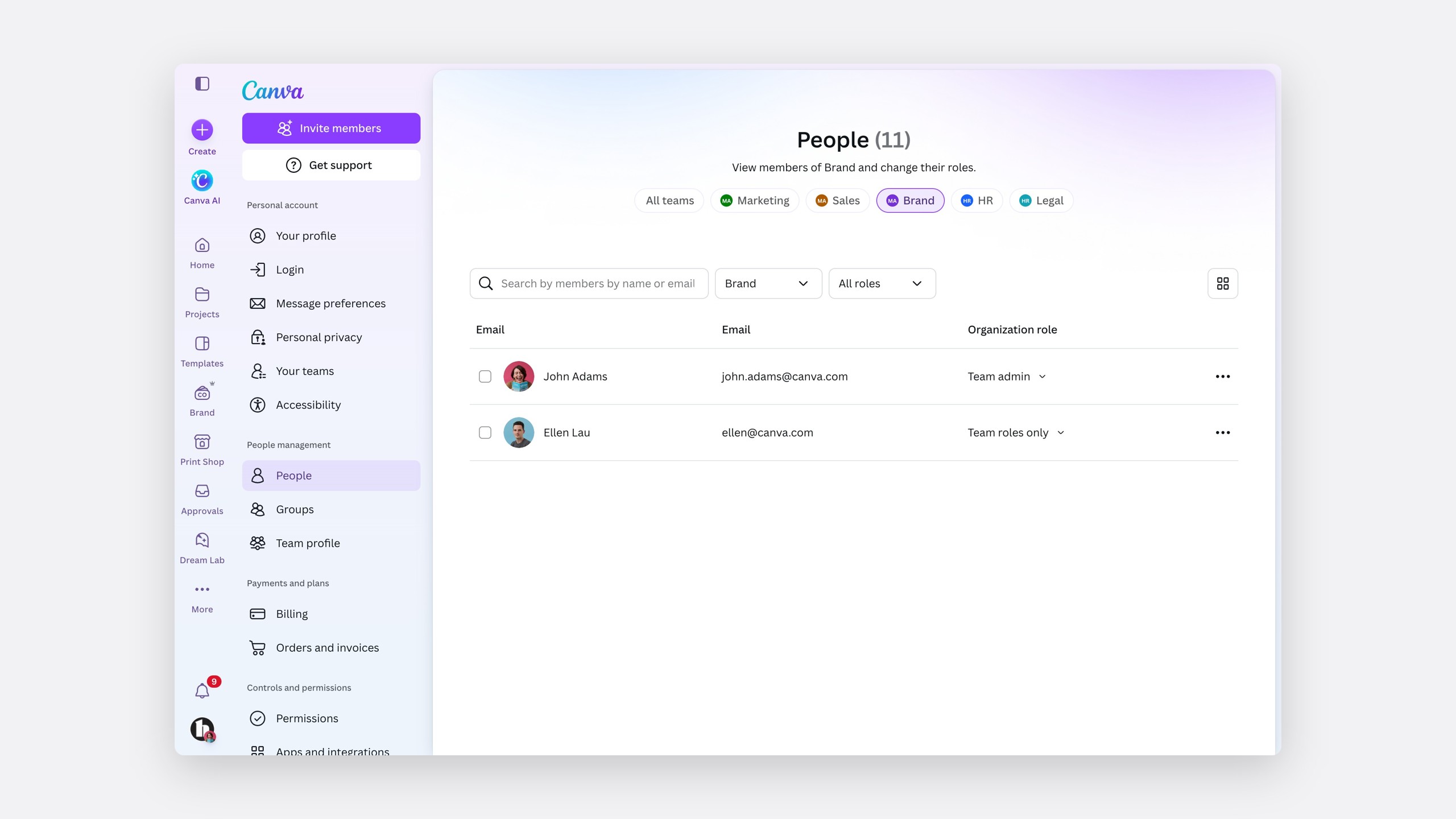
A new page navigation keeps admins inside settings, lets them manage several teams within a page, and lifts every page to the organisation level.
A new page navigation mechanism
Three rounds of tree testing
We tree tested with 234 people who manage software tools at work. The second concept nearly doubled the benchmark.
Tree test success, 234 participants
Key findings
Verbs set the wrong expectation."Manage teams" was just a list of teams.
Organisation and team levels were constantly mixed up.
"Account" was associated with billing.
"Details" and "permissions" were misread.
Mixing up organisation and team was the most costly. Asked how many members were in each team, 40% went to the wrong place and only 10% to the right one.
Tree test
You want to check how many members are part of each team. Where would you go?
The word team, I would think I could find details there.
It seems like it would be the place to see the size of teams and add or remove people.
You would be able to see who is in each team in team details.
Asked where to find an invoice, most went to their account, because "account" meant billing.
Tree test
Where would you go to find an invoice for your subscription?
All things related to my subscription should be under account.
It seems like something that would be managed from the account section.
Again, I expected this to be at a higher level. I ended up finding it under purchase history…
I felt that they were a bit overlapping and only focusing on team structures and not on functionality.
The new information architecture
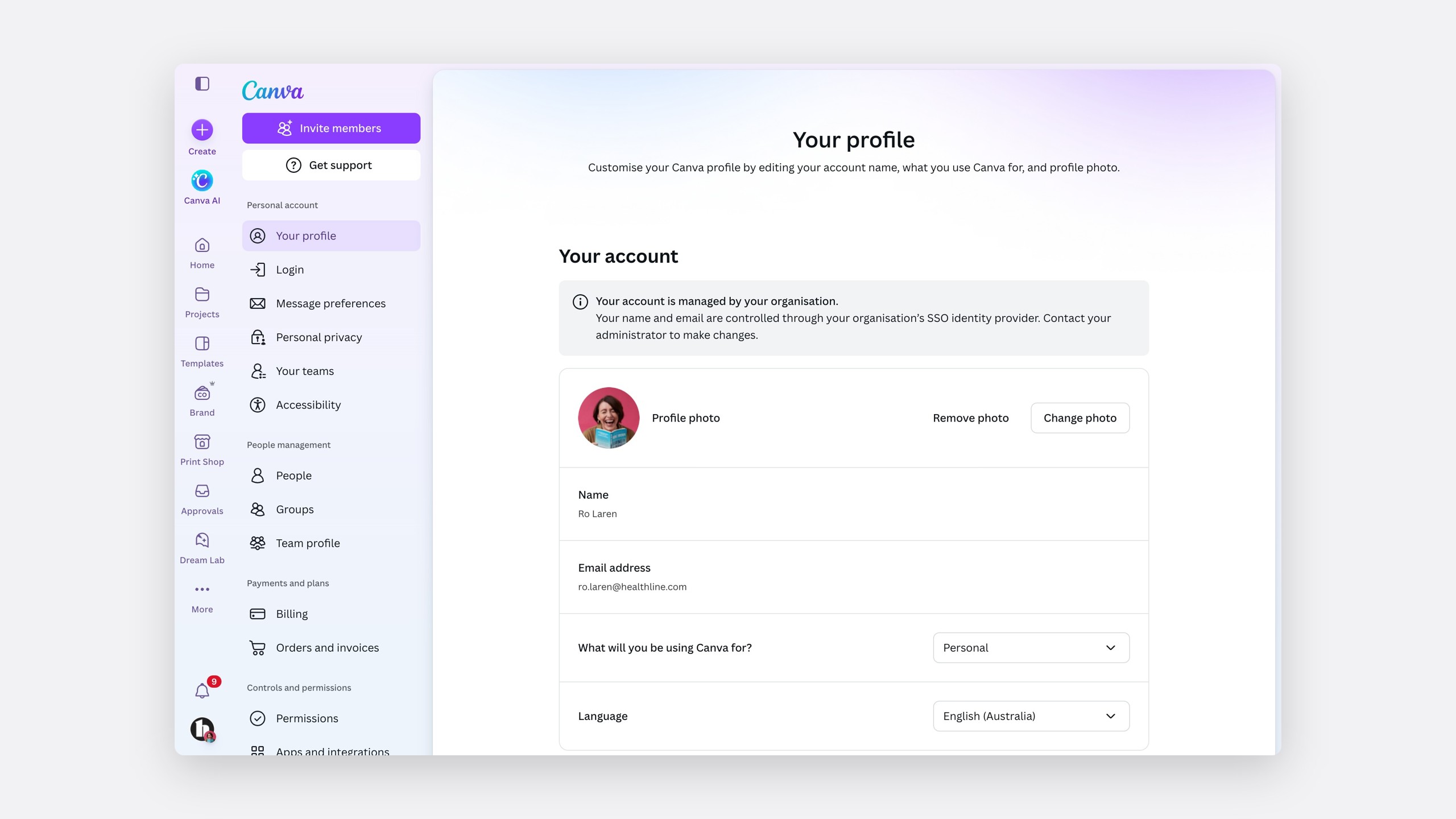
The new IA groups pages by job, and scales from a solo user to an organisation or district.
The new IA
Nine categories, grouped by job
Personal account
- Your profile
- Login
- Message preferences
- Personal privacy
- Accessibility
- Your teams
People management
- Organisation profiles
- Teams
- Groups
- People
Payments and plans
- Billing
- Orders and invoices
Design approvals
- Approval controls
- Approval automation
Reporting
- Domain report
- Usage report
- Brand activity
Controls and permissions
- Permissions
Security
- Organisation privacy
- SSO and provisioning
- Audit logs
Apps and integrations
- Private apps
Domains
- Web domains
Old names to new
Where every page went
Before · Grouped by role
Personal
Organization settings
Team settings
After · Grouped by job
Personal account
People management
Payments and plans
Design approvals
Reporting
Controls and permissions
Security
Apps and integrations
Domains
- Your accountYour profile
- Login & securityLogin
- Message preferencesMessage preferences
- Privacy settingsPersonal privacy
- Organization detailsOrganisation profiles
- TeamsTeams
- PeoplePeople
- SSO & provisioningSSO and provisioning
- Team detailsOrganisation profiles
- PeoplePeople
- GroupsGroups
- Billing & plansBilling
- ReportsUsage report
- PermissionsPermissions
- AppsPrivate apps
- Purchase historyOrders and invoices
- DomainsWeb domains
- Manage teamsTeams
- —Accessibility
- —Your teams
- —Approval controls
- —Approval automation
- —Domain report
- —Brand activity
- —Organisation privacy
- —Audit logs
Milestone five · Organisations
One place to manage every team
In Cycle 4, every enterprise was becoming an organisation, which made the organisation experience critical. It was also the most confusing part of settings.
Problem 01
An unclear hierarchy
Moving between organisations and teams was confusing.
Problem 02
Hard to tell content apart
Organisation and team content looked alike.
Problem 03
Duplicate pages
The same pages existed for the organisation and every team.
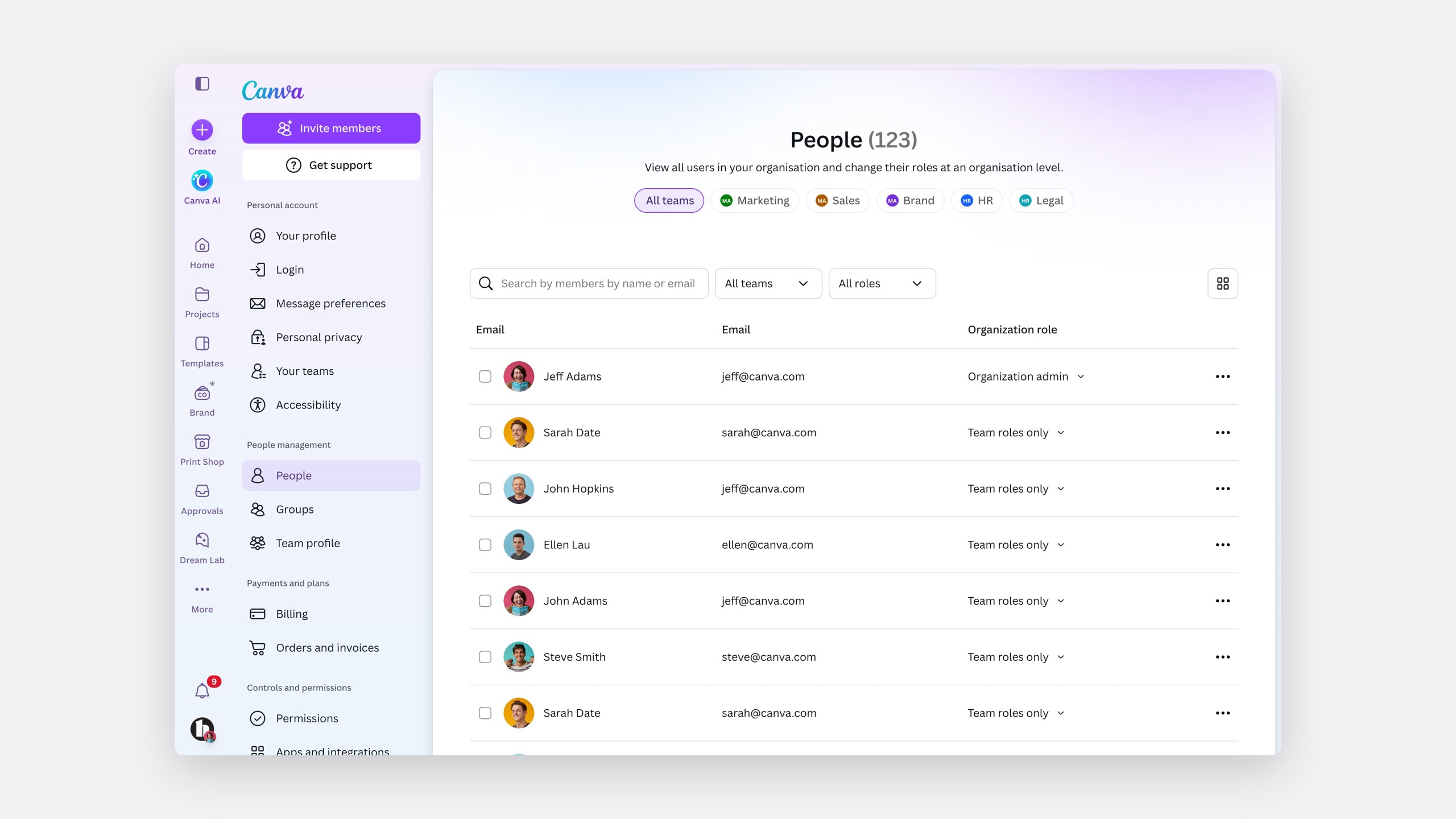
Organisation-wide filters
Our solution was organisation-wide filters throughout settings, so an admin can view a page across all teams, or focus on one.
Organisation-wide filters, throughout settings
The switcher sits at the top
Above the content, on every page.
Filtering with pills
The same pattern as Canva.
A navigational tooltip
Onboarding for the new navigation.
Scope in the title
All teams, or one.
A keyline
Separates organisation and team pages.
Organisation pages in the navigation
Each one reachable from the side.
Testing the order, then the pattern
First, the sequence: do admins pick a team, or the page first?
Option A
Team first
Pick a team, then the page.
Option B · Preferred
Information first
Pick the page, then filter by team.
Hypothesis one
Information first was preferred
76%of participants preferred choosing the page first, 13 of 17
100% task success, for both options.
It gave flexibility and fewer decisions up front.
Second, the selection pattern.
Option one
Filters
A dropdown filter.
Option two
Tabs
Each team as a tab.
Option threePreferred
Top navigation
Every team as a pill.
Hypothesis two
The top navigation was the clear winner
75%of participants preferred the top navigation, 15 of 20
100% task success, for every option.
Participants liked seeing every team at once.
5.6 average teams per Enterprise admin, against 2.1 for Campus.
A clearer hierarchy
A side navigation for the organisation, with a top navigation for teams, separates the two levels clearly.
Stacked
One shared side navigation.
Contained
Team filters inside each page.
Recommended
Top navigation
Side navigation for the organisation, top for teams.
One IA for both
Organisations and teams share one structure.
One People page
Instead of two.
Quick switching
One click between teams.
Always clear
All-team content stands apart.
Four scenarios, eight rounds
We tested the full concept with 58 participants across four scenarios and more than eight rounds.
- 58
Participants
- 4
Scenarios
- 8+
Rounds of iteration
- 96%
Average success, with 118 participants in the final round
The new organisation and team navigation works
Designed for every size
The filter uses pills, switching to a dropdown at five or more teams. Single-team admins never see it.
Organisations by number of teams
Fewer than five teams · pills
Five or more · a dropdown
Before and after
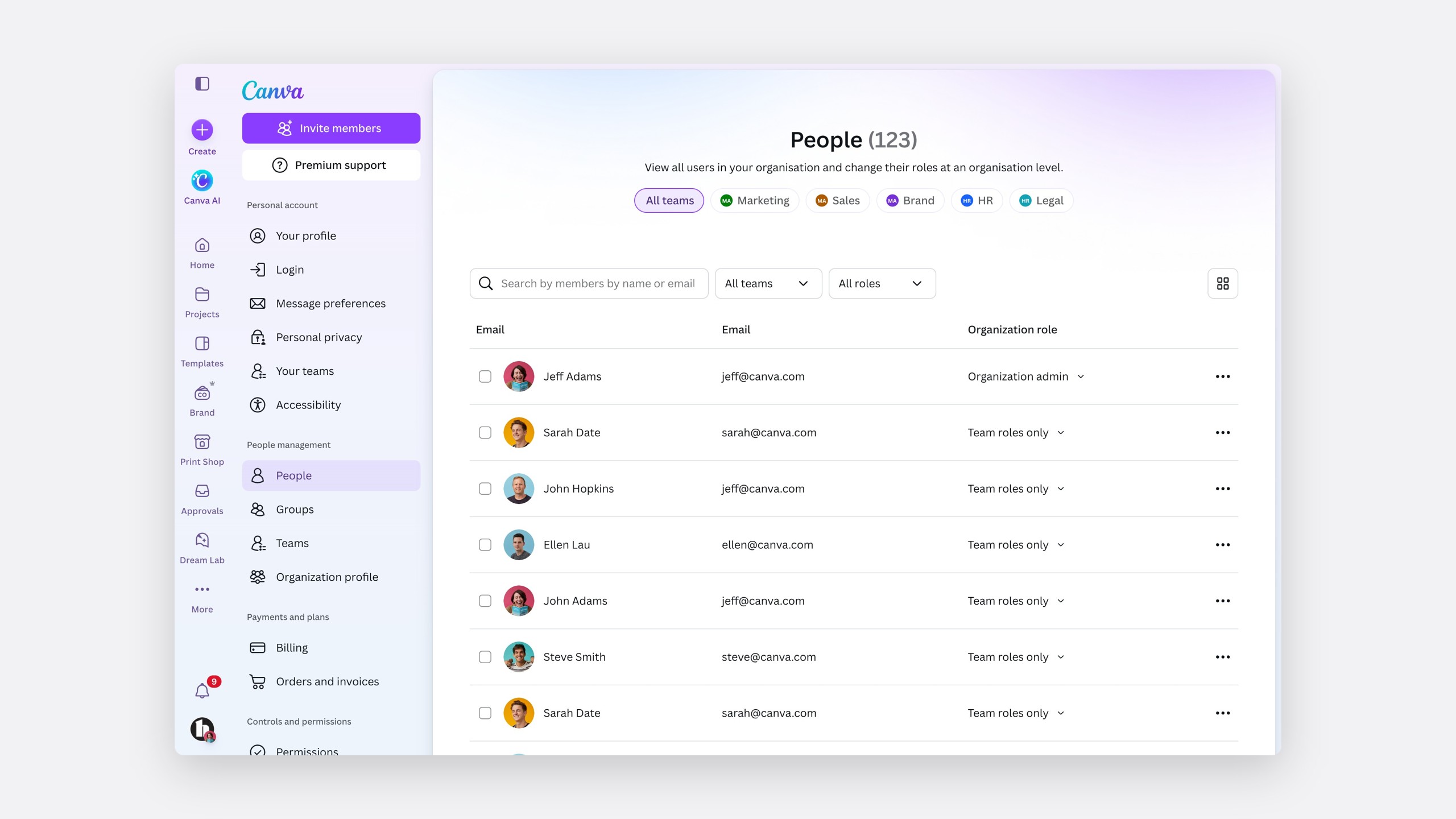
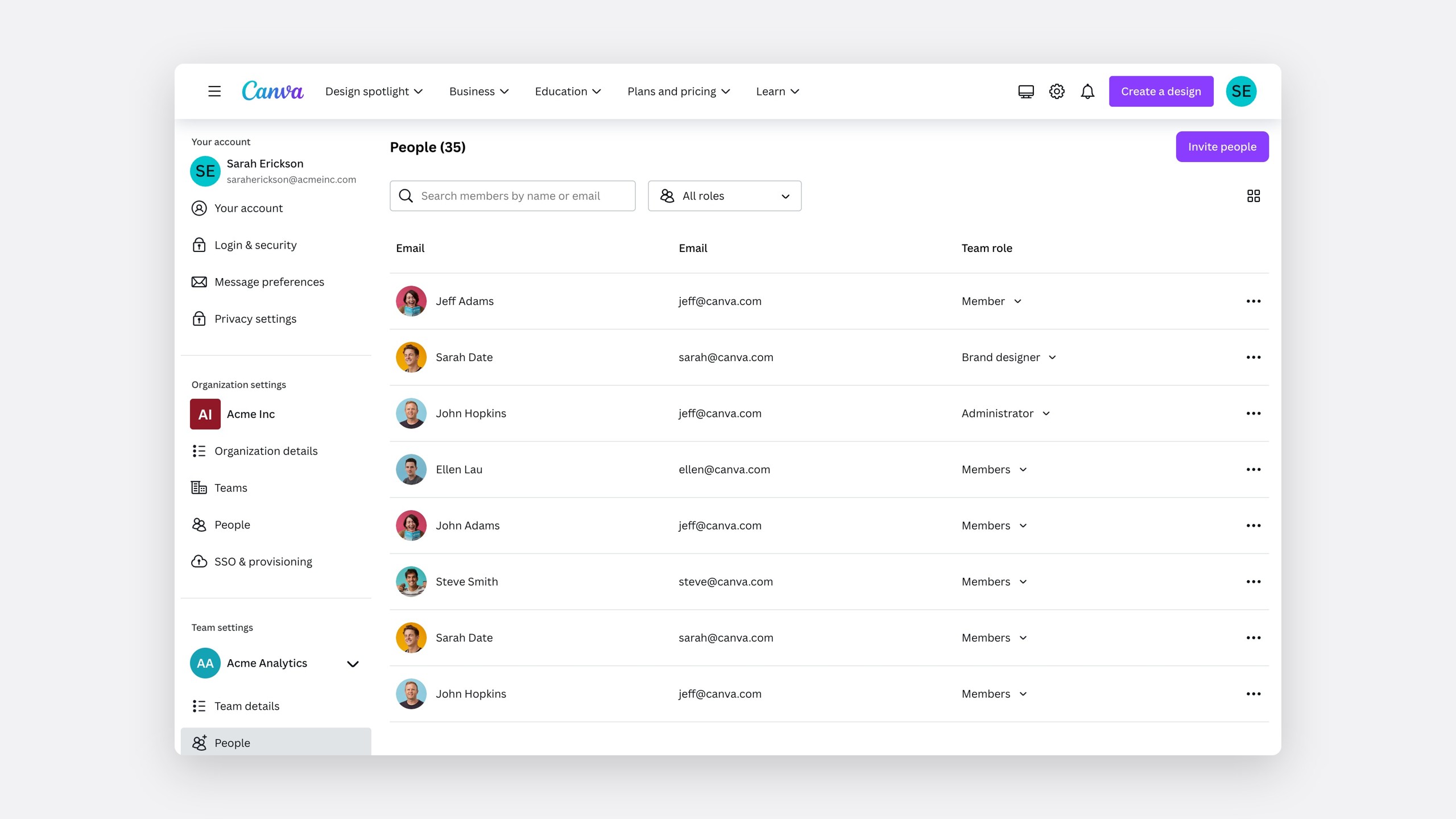 BeforeAfter
The impact
From pages to a system
Settings is now a system, with a frame every owning team builds into.
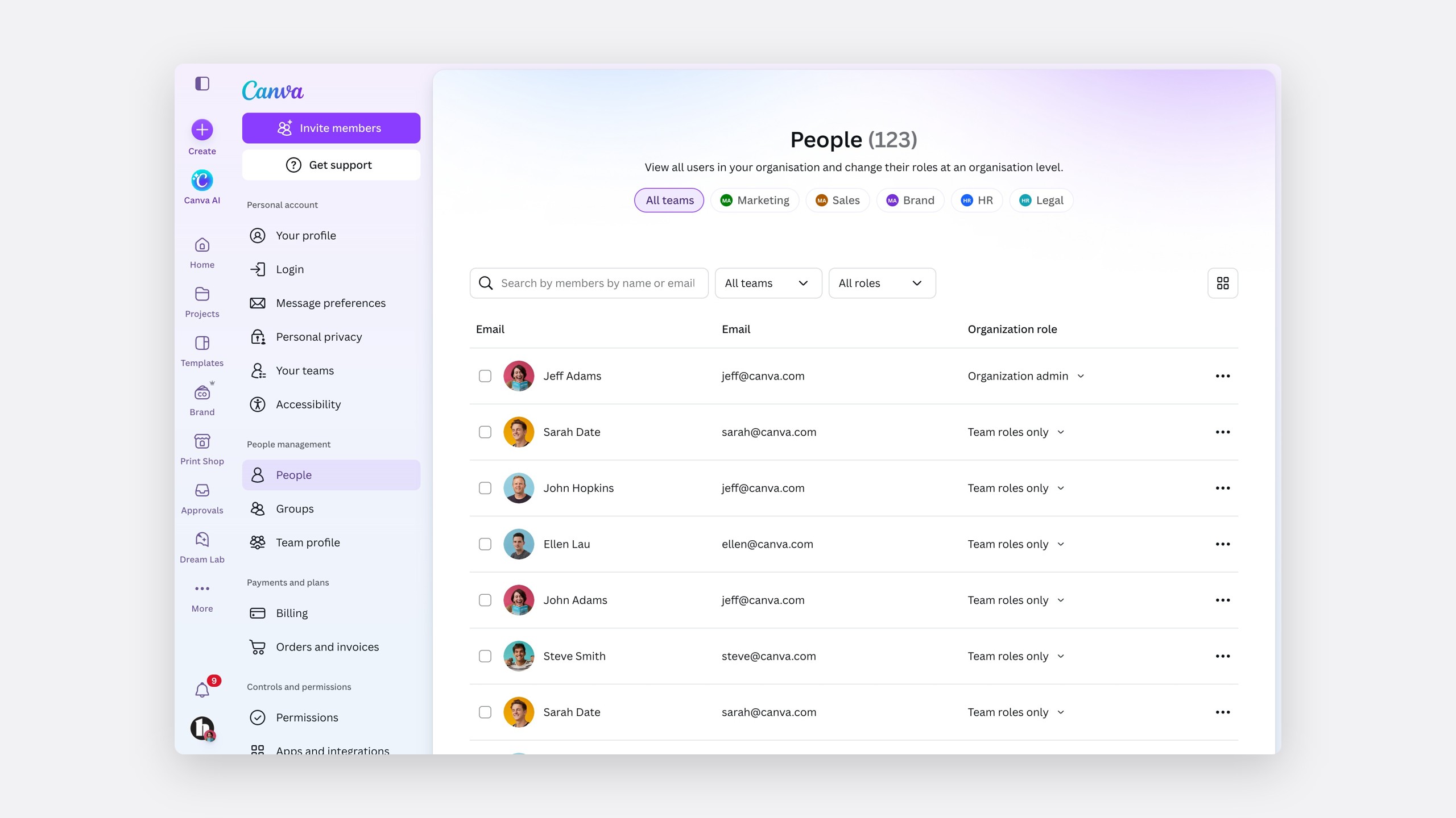
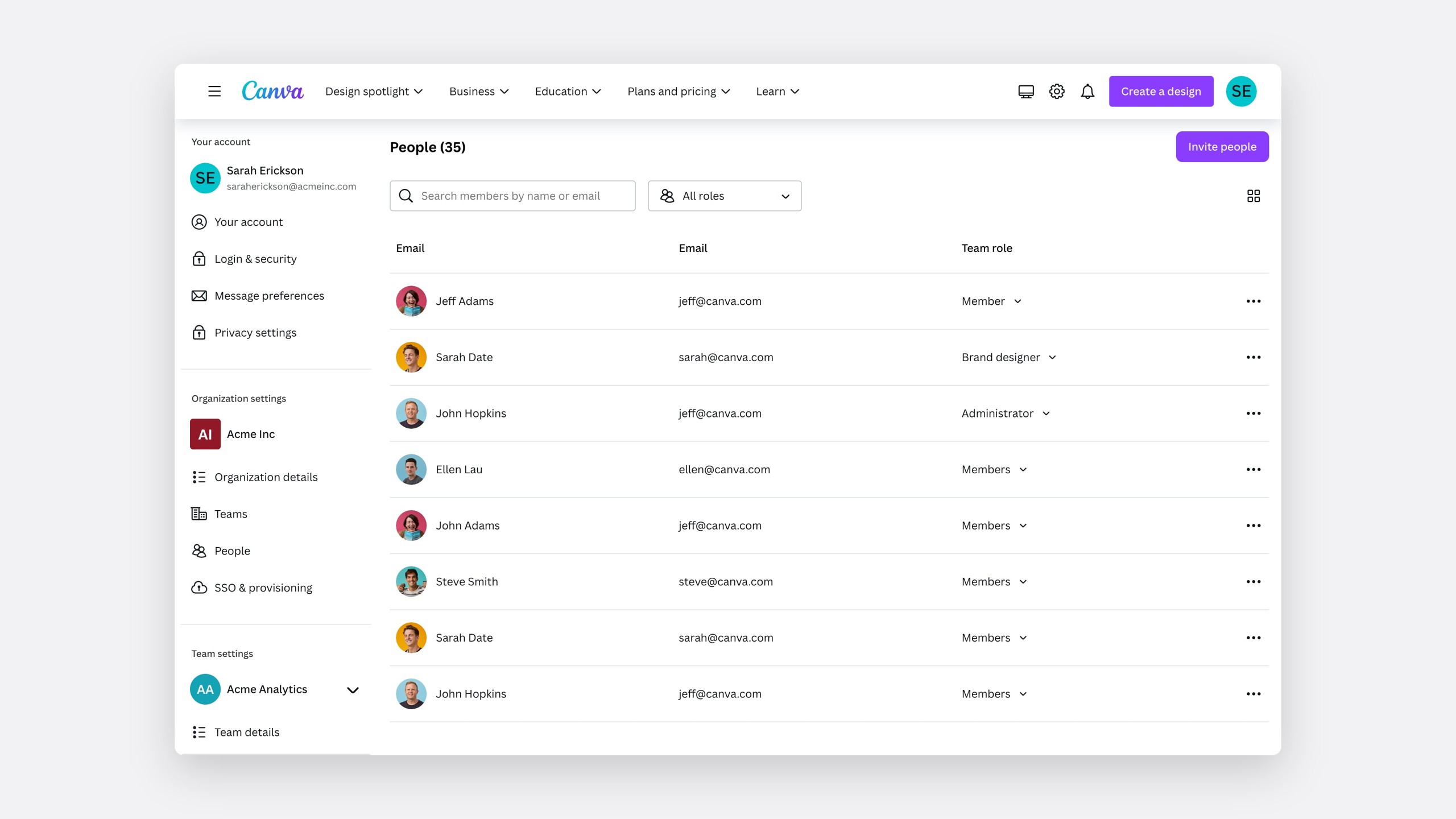 BeforeAfter
For enterprise admins, the change shows in clicks.
Before
3 clicks, and 4 for Groups
Groups across teams also meant a trip through settings and a long load.
After
1 click
One filter, on one page.
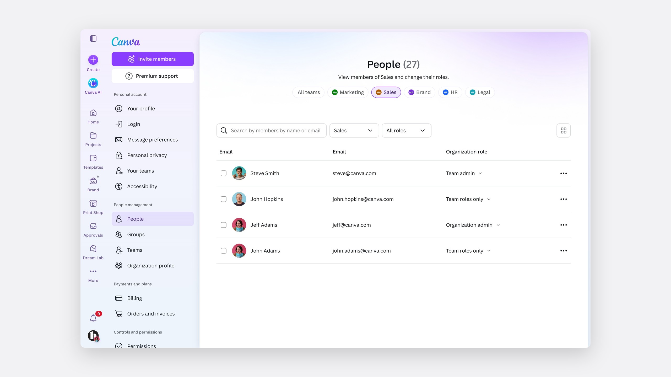
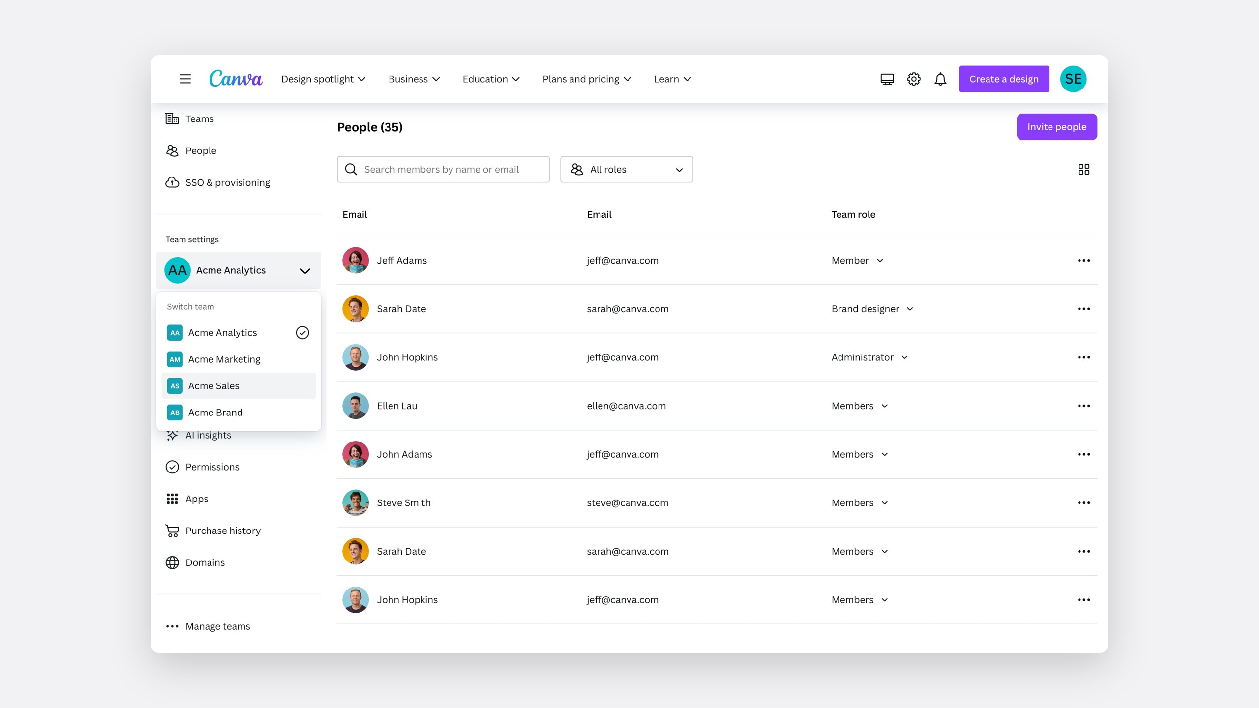 BeforeAfter
Design leadership signed off the first five milestones between November 2024 and February 2025, and I continued as product lead for Settings Experience through the first half of 2025 as they rolled out.
- 33
Usability tests across the glow-up
- 529
Participants, with an average success rate over 98%
- 33%62%
Tree test success, across three rounds with 234 participants
- 31
Clicks to switch teams on People
Reflection
The decision log mattered more than any screen
What moved nine teams in one direction was not a better mockup but a written decision, with options, evidence and a recommendation, that anyone could read. It is the first thing I would build again.
Next time, I would bring the owning teams into tree testing earlier. The sooner they saw the evidence, the sooner they agreed.